
Master Data Visualization Best Practices for Impactful Insights
Unlocking the Power of Data Storytelling
This listicle presents seven data visualization best practices to help you transform data into compelling visuals that drive understanding and better decisions. Whether you're an analyst, accountant, or simply working with spreadsheets, mastering these principles will elevate your data storytelling. Learn how to choose the right chart type, simplify visuals, ensure accuracy, use color effectively, provide context, design for your audience, and create accessible data visualizations. Following these data visualization best practices ensures your data resonates and informs effectively.
1. Choose the Right Chart Type
Selecting the appropriate chart type is the cornerstone of effective data visualization, a crucial element of data visualization best practices. Different visualizations serve distinct analytical purposes. A poorly chosen chart can obscure insights and even mislead your audience, while the right chart can illuminate complex data relationships with clarity and impact. This principle underpins any successful data visualization project, whether you're a seasoned data analyst or just starting to explore the power of visual communication.
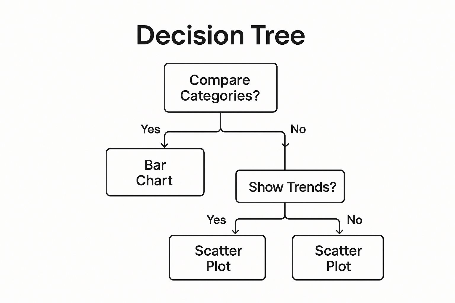
The infographic above presents a simplified decision tree for selecting the right chart type. It starts by asking what kind of relationship you want to show in your data—comparison, distribution, composition, or relationship/trend. Based on your answer, the flowchart guides you towards appropriate chart types, such as bar charts for comparison, histograms for distribution, pie charts for composition, and scatter plots or line charts for relationships and trends.
This selection framework guides you through key decisions when choosing a chart. For example, if you want to compare categories, the chart leads you towards bar charts, column charts or grouped bar charts. If your goal is to visualize a part-to-whole relationship, the chart recommends a pie chart, donut chart, or treemap. Understanding the underlying data relationship is fundamental to picking the chart that communicates your message most effectively.
Features of a Chart Selection Framework:
- Data Relationships: Frameworks consider the core data relationship (comparison, composition, distribution, trend).
- Decision Trees: Visual aids, like the infographic above, simplify chart selection.
- Audience Literacy: Consider your audience’s ability to interpret different chart types.
Pros of Choosing the Right Chart:
- Improved Comprehension: Clarity in visualization drastically improves understanding.
- Reduced Cognitive Load: Appropriate charts make it easier to grasp complex information.
- Prevents Misinterpretation: Correct chart choice minimizes the risk of drawing incorrect conclusions.
Cons:
- Requires Chart Knowledge: You need to understand various chart types and their uses.
- Specialized Visualizations: Some data may require custom solutions.
- Subjectivity: Chart selection can be influenced by context and specific needs.
Examples of Effective Chart Selection:
- Financial Times Visual Vocabulary: Provides a comprehensive guide categorizing chart types by function (Learn more about Choose the Right Chart Type).
- The Economist: Consistently employs appropriate chart types for economic data trends.
- Hans Rosling’s Animated Bubble Charts: Effectively display multi-dimensional demographic data.
Actionable Tips:
- Comparison: Use bar charts for comparing categories.
- Trends: Use line charts to visualize data over time.
- Correlation: Consider scatterplots for showing relationships between variables.
- Composition: Avoid pie charts for more than 5-7 categories; consider a treemap instead.
- Guidance: Use decision trees like the FT Visual Vocabulary to aid chart selection.
When and Why to Use This Approach:
Choosing the right chart type is essential for any data visualization task. Whether you are creating a dashboard for executives, presenting research findings, or simply exploring your data, the right visualization will enhance communication and facilitate insightful analysis. This practice, popularized by experts like Edward Tufte and Alberto Cairo, is fundamental to effectively conveying data-driven narratives. This applies to everyone from data analysts and business intelligence professionals to accountants, finance teams, and even spreadsheet enthusiasts who want to present their data clearly and compellingly. Choosing the right chart ensures your audience, whether they are colleagues, clients, or the general public, can quickly understand your data's story.
2. Simplify and Reduce Clutter
One of the most fundamental data visualization best practices is simplifying and reducing clutter. Effective data visualization hinges on clarity, ensuring the audience quickly grasps the key insights. This principle, often referred to as maximizing the "data-ink ratio" (a concept popularized by Edward Tufte), emphasizes presenting data with the utmost efficiency, minimizing non-data elements that distract from the core message. This means stripping away unnecessary visual elements, redundant information, and excessive decoration, allowing the data itself to take center stage. By reducing visual noise and using white space thoughtfully, you create visualizations that are easier to interpret and more impactful.

This approach offers numerous benefits. It improves both the speed and accuracy of comprehension by reducing the cognitive load on the viewer. A clean, minimalist design also projects professionalism and polish, making the visualizations suitable for presentations to stakeholders, clients, or executive teams. Key insights become immediately apparent when they aren't buried under a layer of chart junk. Whether you're a data analyst creating dashboards, a finance team preparing reports, or simply an Excel enthusiast working on a spreadsheet, embracing simplicity will elevate your data visualizations.
However, simplification isn't without its potential drawbacks. In some cases, removing contextual elements can hinder understanding, especially for audiences unfamiliar with the data. Stripping away all decorative elements might also make visualizations less engaging for a general audience. Furthermore, achieving an impactful minimalist design often requires more design skill than creating a visually busy chart. Finding the right balance between simplicity and context is crucial.
Examples of successful minimalist data visualization can be found in publications like The New York Times, known for their clean and informative infographics, and on platforms like Tableau Public, where popular visualizations often employ a minimalist aesthetic. Bloomberg's financial data dashboards also prioritize data over decoration, demonstrating the effectiveness of this approach in a professional context. Learn more about Simplify and Reduce Clutter
Here are some actionable tips to help you simplify your data visualizations:
- Remove gridlines unless essential: Often, gridlines add more visual clutter than value. Only include them if they are crucial for precise data interpretation.
- Consider removing axes: If exact values aren't critical for understanding the overall trend or comparison, removing the axes can free up valuable visual space.
- Use subtle colors for background elements: Avoid bright or distracting background colors that compete with the data.
- Eliminate redundant labels: When context makes labels obvious, remove them to reduce visual noise. For example, if the chart title clearly indicates the units, repeating those units on the axis might be redundant.
- Be judicious with 3D effects, shadows, and decorative elements: While these can sometimes add visual interest, they often obscure the data and contribute to clutter.
By incorporating these data visualization best practices into your workflow, you can create clearer, more effective visualizations that communicate information efficiently and professionally, regardless of your audience, whether they are accountants, spreadsheet enthusiasts, or executives. The principles of simplification, championed by experts like Edward Tufte and Stephen Few, are fundamental to good data visualization design and contribute significantly to making data more accessible and understandable.
3. Ensure Accurate Data Representation
Accurate data representation is a cornerstone of effective and ethical data visualization. This best practice emphasizes the importance of faithfully presenting data without distortion or manipulation, ensuring that visualizations reflect the underlying numbers truthfully. For data analysts, business intelligence professionals, accountants, and anyone working with data, maintaining data integrity through visual representation is both an ethical obligation and a practical necessity. Even for spreadsheet enthusiasts creating charts for personal use, understanding accurate representation leads to better insights.
This practice goes beyond simply plotting numbers on a graph. It involves careful consideration of several factors:
-
Proper axis scaling and baseline selection: A common manipulation tactic is truncating the y-axis (the vertical axis) to exaggerate small differences. While sometimes used innocently to focus on a specific data range, this can mislead the audience into perceiving a more dramatic change than actually exists. For example, a bar chart showing sales figures might appear to double if the y-axis starts at 90 instead of 0, even if the actual increase is only a few percentage points. This is particularly relevant in areas like climate change graphics, where truncated axes can misrepresent trends.
-
Proportional visual encoding of quantitative values: The size, area, or color intensity of visual elements should be directly proportional to the data values they represent. For instance, in a bubble chart, the area of each bubble should correspond to the magnitude of the data point. If one data point is twice as large as another, its corresponding bubble should have twice the area, not just twice the diameter. Similarly, in treemaps, the area of each rectangle should reflect the data proportionally.
-
Clear representation of uncertainty in data: Data often comes with inherent uncertainty, whether from sampling error, measurement limitations, or forecasting models. Accurately representing this uncertainty is crucial for avoiding overconfidence and misleading interpretations. Techniques like error bars, confidence intervals, and probability distributions in election forecast visualizations (like those by FiveThirtyEight) effectively communicate the range of possible outcomes.
-
Truthful representation of statistical significance: Visualizations should not imply statistical significance where none exists. Using visual cues like asterisks or highlighting specific data points can create a false impression of importance if not backed by proper statistical analysis.
Why This Matters:
Accurate data representation builds trust with your audience, whether they are colleagues, clients, or the public. It leads to better-informed decisions based on a true understanding of the data. Furthermore, it upholds ethical standards in data communication, preventing misleading conclusions and potential misinformation.
Pros:
- Builds trust with your audience
- Leads to better-informed decisions
- Maintains ethical standards in data communication
- Prevents misleading conclusions
Cons:
- Sometimes makes dramatic patterns less visually apparent (though accuracy should always be prioritized)
- May require more complex visualization techniques for complete accuracy
- Can sometimes conflict with stakeholder desires for impactful (but potentially misleading) storytelling
Actionable Tips:
- Use zero-baseline axes for bar charts and area charts, especially when comparing magnitudes.
- Consider using dot plots instead of bar charts when a zero baseline isn't meaningful (e.g., displaying average temperatures).
- Include error bars or confidence intervals when displaying estimated data.
- Maintain proportional sizing in bubble charts and treemaps.
- Use color intensity proportionally to data values, ensuring a clear and consistent scale.
Examples & Influences:
The importance of accurate data representation is highlighted in Darrell Huff's "How to Lie with Statistics," a classic text exposing the ways data can be manipulated visually. Alberto Cairo's "The Truthful Art" provides an ethical framework for data visualization, emphasizing accuracy and clarity. The work of Carl Bergstrom and Jevin West further underscores the importance of combating data misrepresentation. Real-world examples, like debates over the truncated y-axis in climate change graphics and the clear representation of uncertainty in COVID-19 dashboards (showing logarithmic vs. linear scales), demonstrate both the challenges and the importance of this best practice. By prioritizing accurate data representation, we can ensure that data visualizations effectively communicate truth and inform sound decision-making.
4. Use Color Effectively
Color, when used strategically, is a powerful tool in data visualization best practices. It can transform a simple chart into a compelling narrative, highlighting key insights, creating visual hierarchies, and making complex data more accessible. Effective color selection involves much more than just picking aesthetically pleasing hues; it requires a thoughtful approach that considers the data type, audience, and intended message. It enhances data visualization by directing attention, encoding values, and facilitating comparisons, leading to better understanding and retention.

One of the fundamental principles of using color effectively is choosing the right color scheme for your data type. For continuous data, such as sales figures over time, sequential color schemes (light to dark shades of a single color) are ideal. Diverging color schemes, which use two distinct colors that diverge from a central neutral point, are best suited for data with a meaningful midpoint, like profit/loss margins. When visualizing categorical data, such as product categories, limit your palette to 7-10 distinct colors to avoid visual clutter and confusion. Perceptually uniform color palettes, like those found in ColorBrewer, are crucial for ensuring accurate data interpretation across the entire range of values.
The success of data visualization often hinges on clear communication, a principle exemplified by consistent color mapping. Just as The Washington Post uses consistent color coding in their political election maps, assigning colors to specific categories and using them consistently throughout your visualizations strengthens association and reinforces meaning. This consistency is especially beneficial for audiences like accountants and finance teams who frequently work with data-driven reports and dashboards.
Consider the pros and cons: color enhances data comprehension, adds another dimension for encoding data, and improves information retention. However, color perception varies across individuals and cultures. Approximately 8% of men experience some form of color vision deficiency, a factor that must be considered for accessibility. Printing limitations and the potential for visual confusion due to overuse are additional constraints to keep in mind. Tools like ColorBrewer can be used to test visualizations for color blindness accessibility. Learn more about Use Color Effectively
For those working with spreadsheets, from Excel enthusiasts creating complex formulas to office workers simply seeking to improve their reports, applying these color principles can drastically enhance the impact and clarity of their work. Whether you're a data analyst, part of a business intelligence team, or simply a spreadsheet fanatic, using color effectively is an essential skill for communicating data clearly and effectively.
Tips for Effective Color Use:
- Use sequential color schemes (light to dark) for continuous data.
- Apply diverging color schemes for data with a meaningful midpoint.
- Limit categorical color palettes to 7-10 distinct colors.
- Test visualizations for color blindness accessibility using tools like ColorBrewer.
- Consider cultural associations of colors in international contexts.
This practice deserves a spot on any data visualization best practices list due to its significant impact on comprehension and engagement. By following these guidelines, you can leverage the power of color to create visualizations that are not only aesthetically pleasing but also informative and accessible to a wider audience. Drawing inspiration from the work of Cynthia Brewer's ColorBrewer color schemes, Maureen Stone's color design research, and Edward Tufte's principles of information display, you can elevate your data visualizations from simple charts to powerful storytelling tools.
5. Provide Clear Context and Labeling
One of the most crucial data visualization best practices is providing clear context and labeling. A visually stunning chart becomes meaningless if the audience can't understand what it represents. This practice ensures viewers can interpret the data correctly without needing to consult external resources, making your visualizations self-sufficient and impactful. It transforms raw data into actionable insights by providing the necessary background for proper interpretation.
This involves several key features:
- Informative Titles and Subtitles: Instead of simply stating the chart type (e.g., "Line Graph"), the title should reveal the main insight (e.g., "Online Sales Increased 20% in Q4"). Subtitles can provide further details, such as the date range of the data.
- Clear Axis Labels with Units: Axes should be clearly labeled with the variable being measured and the units used (e.g., "Revenue (USD)," "Time (Months)"). This removes ambiguity and allows for accurate interpretation.
- Legends (When Necessary): Legends explain the visual encodings used in the chart (e.g., different colors representing different product categories). However, strive for direct labeling whenever possible, placing labels directly on the data elements themselves to reduce cognitive load.
- Annotations for Key Insights or Anomalies: Highlighting key data points, trends, or outliers with annotations helps draw attention to significant findings and explains unusual patterns. This preemptively answers potential questions viewers might have.
- Data Source Attribution and Methodology Notes: Citing the source of your data and briefly explaining your methodology adds credibility and transparency. This allows viewers to assess the reliability of the visualization and understand any limitations.
Applying these features elevates the standalone quality of your visualizations, making them easily understandable and shareable. Moreover, the transparency fostered by proper context builds credibility with your audience.
However, adding context requires careful design to avoid visual clutter. Too much information can overwhelm the viewer and detract from the main message. It also necessitates editorial judgment to determine the most relevant context for the intended audience. Finally, incorporating comprehensive context might require additional space, which can be challenging in constrained layouts.
Examples of successful implementations of this best practice include:
- The New York Times: Their annotated charts, often explaining key events impacting trend lines, are a prime example of contextualized visualization.
- Our World in Data: Their COVID-19 visualizations are lauded for their comprehensive context, providing viewers with all the necessary information to understand the complex data.
- FiveThirtyEight: Known for their explanatory approach to election forecasts, FiveThirtyEight effectively uses context to make their complex statistical models accessible to a broader audience.
Tips for Effective Context and Labeling:
- Write titles that reveal the main insight.
- Include the data timeframe in the subtitle or caption.
- Use direct labeling instead of legends when possible.
- Annotate unusual patterns or outliers.
- Include footnotes for methodological details or data limitations.
This best practice is essential for anyone working with data, from data analysts and business intelligence professionals to accountants, finance teams, and even spreadsheet enthusiasts. Clear context empowers your audience—whether they are colleagues, clients, or the general public—to quickly grasp the story your data is telling. Learn more about Provide Clear Context and Labeling This is particularly important for those creating dashboards, presentations, or reports where clear communication is paramount. By providing context, you transform data from a collection of numbers into a powerful narrative. This approach, popularized by figures like Amanda Cox and the New York Times graphics team, Hans Rosling, and Cole Nussbaumer Knaflic, has become a cornerstone of effective data communication.
6. Design for Your Audience
A crucial data visualization best practice often overlooked is designing with your audience in mind. Creating stunning visuals is pointless if they don't effectively communicate the intended message to the right people. This user-centered approach is fundamental to maximizing the impact and utility of your data visualizations, making it a cornerstone of effective data storytelling. It involves understanding and accommodating your audience's specific needs, background knowledge, data literacy level, and the context in which they will be interacting with the visualization.
This means considering several key factors:
- Data Literacy and Domain Expertise: Are you presenting to seasoned statisticians or to a team less familiar with data interpretation? A highly technical visualization might impress experts but leave a non-technical audience bewildered. Conversely, oversimplification for a knowledgeable audience can lead to frustration and a loss of valuable insights.
- Goals and Questions: What are the core questions your audience wants answered? A visualization should directly address these questions and provide clear, actionable insights. A beautiful chart showcasing irrelevant data is ultimately useless.
- Complexity and Learning Curve: The ideal visualization balances detail with accessibility. Too much information can overwhelm, while too little can leave the audience wanting more. Consider progressive disclosure techniques – start with a high-level overview and allow users to drill down into more granular data as needed.
- Context-Sensitive Design: Where and how will the visualization be viewed? A dashboard displayed on a large monitor allows for more complexity than a chart viewed on a mobile device. Similarly, visualizations intended for print require different design considerations than those displayed digitally.
Successful Implementations:
- The Economist: Known for its clear and concise data visualizations tailored for a business-savvy audience, often using sophisticated charts to convey complex economic trends.
- Centers for Disease Control and Prevention (CDC): The CDC masterfully adapts its visualizations for different audiences. Simplified charts and infographics communicate key COVID-19 information to the general public, while detailed dashboards provide healthcare professionals with in-depth epidemiological data.
- Bloomberg Terminal: This platform provides highly complex financial visualizations designed specifically for expert users in the financial industry, leveraging their existing knowledge and requiring a steep learning curve.
Actionable Tips:
- Research Your Audience: Before designing, invest time in understanding your audience’s expertise, needs, and the context in which they will be using the visualization. Surveys, interviews, or even informal conversations can provide valuable insights.
- Progressive Disclosure: For complex data, consider starting with a simple overview and allowing users to interact with the visualization to explore deeper layers of information.
- User Testing: Test your visualizations with representative users before finalizing the design. This will help identify potential usability issues and ensure the visualization effectively communicates its message.
- Explanatory Text: Don't be afraid to use annotations, labels, and captions to clarify complex concepts or highlight key takeaways.
- Device and Viewing Context: Consider how the visualization will be viewed – on a mobile device, large screen, or printed – and adjust the design accordingly.
Pros and Cons:
Pros:
- Improved engagement and understanding
- Increased likelihood of insights being acted upon
- Builds trust by meeting user needs
- Creates more impactful and useful visualizations
Cons:
- May require creating multiple versions for different audiences
- Requires research to understand audience needs
- Balancing simplification and accuracy can be challenging
Why This Matters:
Designing for your audience is not merely a "nice-to-have" but a critical best practice in data visualization. By tailoring your visualizations to the specific needs and context of your audience, you ensure that your data effectively communicates its intended message, leading to better understanding, improved decision-making, and ultimately, more impactful results. This principle aligns with established user-centered design principles championed by experts like Alberto Cairo (author of "The Functional Art"), Ben Shneiderman (known for his visualization mantra: "Overview first, zoom and filter, then details-on-demand"), and the Nielsen Norman Group, further solidifying its importance within the field of data visualization.
7. Create Accessible Visualizations
Data visualization best practices must include accessibility to ensure insights are available to everyone, regardless of any visual, cognitive, or motor impairments. This principle hinges on applying universal design principles, making visualizations perceivable and understandable for diverse audiences. Accessible data visualization goes beyond simply choosing the right colors; it encompasses alternative text, keyboard navigation, screen reader compatibility, and offering multiple ways to access the same information. This crucial practice not only broadens your audience but also significantly enhances the clarity and overall usability of your visualizations.
Creating accessible visualizations involves considering several key features:
- Color Choices for Color-Blind Users: Opt for color palettes that are distinguishable for individuals with various forms of color blindness. Tools like color blindness simulators can help verify your choices.
- Alternative Text Descriptions: Provide concise and informative alternative text (alt text) descriptions for screen readers to convey the meaning and insights of the visualization, not just a description of the chart elements. Meaningful alt text is critical for users who cannot see the visual representation.
- Multiple Encoding Channels: Encode key information using multiple channels like color, shape, and pattern. This redundancy ensures that information isn't lost if one channel is inaccessible to a user. For example, in a bar chart representing sales figures, you could use different colors and patterns for each bar, allowing colorblind users to distinguish the data.
- Text Alternatives and Data Tables: Accompany complex visualizations with data tables or text summaries, offering alternative ways to access the underlying data. This is especially beneficial for users who may have difficulty interpreting visual data.
- Keyboard Navigation: Design interactive elements with keyboard navigation in mind, ensuring that all functionalities are accessible to users who cannot use a mouse.
The benefits of prioritizing accessible data visualization are numerous:
- Wider Reach and Compliance: Accessible visualizations reach a wider audience, including people with disabilities, and help ensure compliance with accessibility regulations.
- Improved Usability for All: Often, design choices made for accessibility enhance the usability for all users, not just those with disabilities. Clearer labeling and multiple encoding channels, for example, can benefit everyone.
- Clarity in Design Thinking: Designing for accessibility forces clarity in design thinking, pushing creators to focus on the essential information being conveyed.
- Ethical Information Sharing: Accessibility aligns with ethical principles of inclusive information sharing, ensuring that data and insights are available to everyone.
However, there are also some challenges to consider:
- Development Time and Resources: Implementing accessibility features can require additional development time and resources.
- Design Constraints: Accessibility considerations can sometimes constrain design choices or limit visual complexity.
- Specialized Knowledge: Creating truly accessible visualizations often requires specialized knowledge about accessibility standards like the WCAG 2.1 AA standard for contrast.
Examples of successful implementations of accessible data visualization include The Urban Institute's 'Do No Harm Guide' for accessible data visualization, the UK Government's accessible data visualization standards, and The Economist's use of patterns alongside colors in print visualizations. Learn more about Create Accessible Visualizations
Tips for Creating Accessible Visualizations:
- Test your visualizations with color blindness simulators.
- Provide data tables alongside complex visualizations.
- Write meaningful alt text that describes insights, not just chart elements (e.g., "Sales increased by 20% in Q4," not "Bar chart showing sales data").
- Ensure sufficient contrast between text and background. The WCAG 2.1 AA standard is a good guideline.
- Use direct labeling on charts instead of relying on hover or click interactions to reveal information.
The importance of accessible data visualization has been championed by individuals like Frank Elavsky with his work on accessible data visualization, Sarah Herrlinger at Apple promoting accessibility in design, and Amy Cesal's writing on inclusive data visualization design. By following these best practices, data analysts, business intelligence professionals, accountants, and anyone working with data can ensure their visualizations are inclusive and beneficial for everyone. This approach makes data-driven insights truly accessible and fosters a more equitable and informed environment for all.
7 Best Practices Comparison Guide
| Best Practice | Implementation Complexity 🔄 | Resource Requirements ⚡ | Expected Outcomes 📊 | Ideal Use Cases 💡 | Key Advantages ⭐ |
|---|---|---|---|---|---|
| Choose the Right Chart Type | Medium – requires understanding multiple chart types and decision frameworks | Moderate – some tools and knowledge needed | High – improves comprehension, insight generation, reduces misinterpretation | When data relationships differ (comparison, trends, relationships) | Enhances clarity, reduces cognitive load, prevents errors |
| Simplify and Reduce Clutter | Low to Medium – involves removal of non-essential elements and design skills | Low – mainly design refinement efforts | High – faster comprehension, polished visuals, clearer insights | Visuals needing focus and professionalism | Improves speed and accuracy, reduces distraction |
| Ensure Accurate Data Representation | Medium to High – may need complex techniques and ethical checks | Moderate – may need specialized visualization tools | High – builds trust, prevents misleading conclusions | Situations requiring ethical, precise data communication | Maintains data integrity, supports ethical standards |
| Use Color Effectively | Medium – requires knowledge of color theory and accessibility | Moderate – may require tools and testing | High – enhances grouping, guides attention, improves recall | Visuals needing emphasis, categorization, or accessibility | Adds a data dimension, improves comprehension and retention |
| Provide Clear Context and Labeling | Low to Medium – focused on thoughtful text and layout | Low – mainly editorial effort | High – enables correct interpretation, builds credibility | Any visualization intended for broad or expert audiences | Improves standalone quality, increases transparency |
| Design for Your Audience | Medium to High – requires audience research and iterative testing | Moderate to High – user research and testing needed | High – better engagement, actionable insights | Visualizations targeted to specific groups with distinct needs | Tailored complexity, improves trust and usefulness |
| Create Accessible Visualizations | Medium to High – involves applying accessibility standards and testing | Moderate to High – development and expertise required | High – wider reach, ethical inclusivity, better usability | Visualizations for diverse or regulated audiences | Ensures inclusivity, improves overall usability |
Level Up Your Data Game with SumproductAddict
From selecting the right chart type to ensuring accessibility, the data visualization best practices covered in this article provide a robust framework for transforming raw data into compelling narratives. Remember, the most impactful visualizations are those that effectively communicate insights, facilitate understanding, and drive informed decision-making. By simplifying your designs, using color strategically, and providing clear context, you empower your audience to grasp complex information quickly and easily. Mastering these data visualization best practices can significantly enhance your reports, presentations, and overall communication effectiveness. If you're aiming to enhance your content's reach and impact, consider exploring best practices for creating SEO content for website success; this comprehensive guide from Outrank, "The Ultimate Guide to Creating SEO Content for Website Success," provides valuable insights into crafting content that resonates with both search engines and your target audience.
Mastering data visualization best practices is a continuous journey. As you refine your skills, remember that SumproductAddict offers a unique way to showcase your data-driven style. From witty Excel-themed apparel to practical office accessories, our collection celebrates the world of spreadsheets and data visualization. Ready to add a touch of personality to your data-driven life? Visit SumproductAddict and use code FIRST10 for an exclusive discount on your first order!