Excel Dashboard Tutorial: Build Stunning Interactive Reports
Share
Mastering Excel Dashboard Fundamentals That Actually Work

Creating effective Excel dashboards is more than just presenting data; it's about telling a story. Like a skilled narrator, a dashboard creator must curate information, highlighting key insights and eliminating distractions. This careful selection of metrics is essential.
Instead of overwhelming the user with excessive data points, focus on the key performance indicators (KPIs) that drive decision-making. This creates a dashboard that informs and engages, rather than confuses.
Planning Your Excel Dashboard for Success
Effective Excel dashboards begin with a well-defined plan. Much like a writer outlining a story, a dashboard creator must define the purpose and audience. Key questions to ask include: Who is the target audience? What information are they looking for? What actions should they take based on the data?
Understanding these needs from the outset prevents costly redesigns and ensures the dashboard's effectiveness. Proper planning also allows for the integration of interactive elements. Features like dropdown menus and slicers empower users to explore the data from various angles.
The continued popularity of Microsoft Excel underscores its importance in dashboard creation. As of 2025, over 123,479 companies globally use Excel as a productivity tool, showcasing its relevance in data management and visualization. Find more detailed statistics here. This widespread adoption highlights Excel's robust and user-friendly interface, making it a popular choice for building interactive dashboards.
Structuring Data for Optimal Dashboard Performance
Well-structured data is the cornerstone of any effective Excel dashboard. This involves organizing data for easy understanding, analysis, and visualization. Think of your data as the foundation of your dashboard: if the foundation is weak, the entire structure is compromised.
For example, maintaining consistent naming conventions across spreadsheets and using data validation techniques are crucial. These proactive steps minimize future maintenance issues and ensure the dashboard's reliability. You might be interested in learning more about using specific Excel functions: How to master SUMPRODUCT in Excel.
Balancing Comprehensive Data with Visual Clarity
The best dashboards achieve a balance between comprehensive data and visual clarity. Too much information can overwhelm users, while too little can be insufficient. Choosing appropriate chart types, using color and formatting strategically, and avoiding clutter are key.
A combination chart, for instance, effectively displays multiple data relationships, while conditional formatting offers immediate visual cues. By prioritizing clarity and user experience, you create a dashboard that is both insightful and visually appealing. This involves understanding the dashboard's purpose, knowing which metrics to highlight, and focusing on user experience. By adhering to these fundamentals, you can create a truly effective dashboard that drives data-driven decisions and delivers valuable insights.
Building Data Structures That Won't Break Your Dashboard

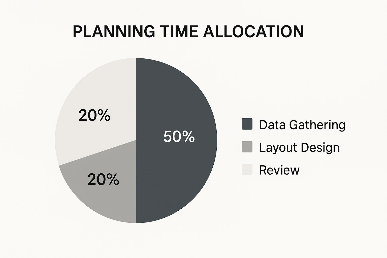
The infographic above shows how to allocate your time when planning a dashboard. It's split into Data Gathering (30%), Layout Design (50%), and Review (20%). Notice how Layout Design takes the biggest chunk? This highlights how important a well-structured visual presentation is.
Gathering accurate data is crucial, and reviewing is essential for refinement. But how you visually present your data carries the most weight. This is why robust data structures are the foundation of any successful Excel dashboard tutorial.
A well-built dashboard depends on clean, organized data. Think of it like building a house: a weak foundation creates instability. Similarly, disorganized data will make your Excel dashboard tutorial hard to build and maintain. This is a common sticking point, but a few key techniques can transform messy data into a dashboard-ready format.
Dynamic Data Tables: Prepare For Growth
Dynamic data tables are key to structuring your data. These tables automatically expand as you add new information, saving you from manual adjustments. Imagine tracking monthly sales: a dynamic table automatically adds new months as they come along.
This keeps your dashboard up-to-date without constant restructuring.
Naming Conventions: Future-Proofing Your Work
Clear and consistent naming conventions are crucial for long-term maintenance. Imagine trying to decipher confusing column names months later. Proper naming ensures that everyone understands the data.
For example, use "MonthlySales_2024" instead of "Column A."
Data Validation: Preventing Errors Before They Happen
Data validation acts like a safety net, stopping bad data before it enters your spreadsheet. This might include dropdown lists for specific entries or restrictions to keep numbers within a certain range.
This protects your data's integrity and prevents errors that could skew your dashboard’s insights.
Structured References: The Power of Dynamic Formulas
Beyond basic formulas, structured references can greatly improve your dashboard. They let you refer to data table parts by name, making formulas easier to read and less error-prone when tables change.
Instead of =SUM(A1:A10), use =SUM(Table1[Sales]).
Comparing Data Structures: Good Vs. Bad Design
Let's look at how data structure impacts your Excel dashboard tutorial:
To illustrate the importance of well-structured data, let's compare the best practices with common pitfalls in dashboard design:
| Data Element | Good Practice | Poor Practice | Impact on Dashboard |
|---|---|---|---|
| Data Organization | Dynamic Tables | Static Ranges | Difficulty updating, potential for broken links |
| Naming | Descriptive, Consistent Names | Generic Labels | Confusion, difficult maintenance |
| Error Prevention | Data Validation Rules | No Validation | Inaccurate data, misleading insights |
| Formulas | Structured References | Static Cell References | Errors when data changes, difficult to scale |
This table clearly demonstrates how crucial proper data structuring is for building a robust and maintainable dashboard. Ignoring these best practices can lead to significant issues down the line.
For more advanced data analysis, check out this resource: How to master PivotTables in Excel. Following these practices builds a stronger, more functional dashboard. This sets you up for creating great charts and visualizations, the next step in our Excel dashboard journey.
Creating Charts That Tell Compelling Data Stories

Data structuring is fundamental, but visualizing that data is where your Excel dashboard tutorial truly shines. Instead of relying on standard pie charts and bar graphs, let's explore how to create visualizations that resonate with your audience and deliver clear, actionable insights. This involves understanding how visuals communicate and choosing the right chart for your message.
Mastering Combination Charts in Excel
Combination charts in Excel allow you to showcase multiple data relationships within a single chart. Imagine displaying sales figures as columns and profit margins as a line, all on the same graph. This immediately reveals the correlation between these two key metrics.
This approach offers a more complete and nuanced understanding of the data compared to using separate charts.
Utilizing Conditional Formatting for Visual Cues
Conditional formatting adds immediate visual cues to your dashboard. You can color-code cells based on specific values. For instance, sales exceeding a target might be highlighted in green, while those below target could appear in red.
This allows users to quickly pinpoint areas needing attention without having to pore over raw numbers.
Building Custom Charts in Excel
Excel offers a variety of standard chart types, but sometimes a unique visualization is needed. This is where custom charts come into play. By adjusting chart elements and blending chart types, you can tailor visualizations to your exact requirements. Consider a custom "thermometer" chart to track progress toward a goal, or a "waterfall" chart to illustrate financial performance.
Customizing charts ensures your dashboard is distinctive and presents information effectively.
Interactive Charts: Engaging Your Audience
Static charts offer information, but interactive charts take your Excel dashboard tutorial to a whole new level. By incorporating dropdown menus and slicers, you create a dynamic experience for stakeholders to explore data from various perspectives. A slicer could filter data by product category, region, or time period, allowing users to control what's displayed in the chart.
This hands-on exploration makes the data more engaging and insightful, encouraging deeper interaction with the dashboard. In fact, studies demonstrate that interactive visualizations significantly boost engagement. Research across 2,500 dashboard implementations found that interactive visualizations with user controls led to 8.3x greater engagement and 94% higher adoption rates compared to static reports. Explore this topic further. Also, learn more about best practices here: How to master data visualization.
By mastering these charting techniques, your Excel dashboard evolves from a simple data display into a dynamic storytelling platform that fosters understanding and informed decision-making. This increased interactivity not only enhances user engagement but also deepens stakeholders' comprehension of the data. This then sets the stage for designing user-friendly controls, a critical next step in creating truly effective and engaging dashboards.
Designing User Controls That People Actually Want To Use
A well-designed Excel dashboard goes beyond visually appealing charts and organized data. It empowers users to explore and understand the information independently. User controls are essential to this process. They bridge the gap between static data presentation and dynamic user exploration, transforming a static spreadsheet into a powerful tool for discovery.
Slicers: Filtering Data With Ease
Slicers offer an intuitive way to filter dashboard data. Imagine clicking buttons to instantly view sales figures for a specific region or product category. This interactive element allows users to quickly and efficiently isolate the data they need.
- Visual Appeal: Slicers present filtering options clearly, making navigation straightforward.
- Dynamic Filtering: The dashboard view updates instantly when using slicers.
- Ease of Use: Simple clicks replace complex filter formulas, making data exploration accessible to everyone.
Dropdown Menus: Controlling Data Views
Dropdown menus provide users with the ability to select different views or parameters for the displayed data. This offers greater control over the information presented and how it appears. Think of selecting various timeframes or levels of analysis from a menu for a more personalized view.
- Structured Choices: Dropdown menus offer predefined options, guiding user interaction.
- Clear Control: Users clearly understand the available options, eliminating any confusion.
- Streamlined Presentation: A single dropdown menu can provide access to multiple views, minimizing dashboard clutter.
Form Controls: Personalized Interactions
Form controls, such as scroll bars and radio buttons, further enhance interactivity. A scroll bar could control a parameter's value, like adjusting a projected growth rate, while radio buttons allow quick switching between different scenarios.
- Parameter Adjustment: Scroll bars offer precise control for values, enabling detailed sensitivity analysis.
- Scenario Switching: Radio buttons make it easy to toggle between predefined settings.
- Enhanced User Engagement: Form controls provide a hands-on approach, encouraging exploration and deeper understanding.
Advanced Techniques: Taking User Control to the Next Level
Going beyond basic user controls, advanced techniques add significant depth to your Excel dashboards. Consider implementing the following:
- Cascading Dropdown Menus: Create menus where selections in one dropdown dynamically affect the options in another. Selecting a country in the first dropdown could filter available cities in a second, creating a logical hierarchy.
- Radio Buttons for View Switching: Use radio buttons to quickly change between chart types or data perspectives. This allows users to analyze data in multiple formats effortlessly.
This increased focus on user experience highlights the growing demand for interactive dashboards. As data-driven decisions become increasingly important, the market for dashboard software, including Excel-based solutions, is expanding rapidly. The market was valued at $6 billion in 2024 and is projected to reach $6.88 billion in 2025, with a 14.3% CAGR expected through 2029. This growth reflects the crucial role of data accessibility and real-time insights. Discover more insights about dashboard software growth here.
Designing Intuitive Dashboard Navigation
The placement and organization of user controls heavily influence the overall user experience. Effective dashboard navigation guides users through the information logically, facilitating seamless exploration. This is critical for empowering even non-technical users to gain insights independently.
- Logical Flow: Arrange controls in a way that mirrors the user's thought process.
- Clear Labeling: Descriptive labels clearly communicate the purpose of each control.
- Visual Grouping: Group related controls together to improve clarity and usability.
Combining slicers, dropdown menus, and form controls empowers users to explore data effectively. Well-designed controls create a bridge between complex data and actionable insights, ultimately increasing the value and effectiveness of any Excel dashboard. This high level of user engagement defines truly impactful dashboards, fostering a culture of self-service analytics within an organization.
Advanced Formulas That Automate Your Dashboard Magic
Moving beyond simple SUM formulas opens a world of possibilities for your Excel dashboards. This tutorial section delves into advanced functions that transform static spreadsheets into dynamic, automated reporting tools. Mastering these functions not only reduces manual maintenance but also minimizes errors, ensuring your dashboards provide accurate and timely insights.
Dynamic Arrays: Adapting to Change
Dynamic arrays, introduced in newer versions of Microsoft Excel, automatically resize to accommodate changing data. This means formulas like FILTER, SORT, and UNIQUE return results that spill into adjacent cells as needed, eliminating manual adjustments. For example, the UNIQUE function can automatically extract a list of unique product names from a growing sales database, updating the dashboard whenever new products are added.
XLOOKUP: The Ultimate Lookup Function
Forget the limitations of VLOOKUP and HLOOKUP. The XLOOKUP function offers greater flexibility and efficiency when retrieving data from tables. It can search both vertically and horizontally, handle approximate and exact matches, and even return entire rows or columns of data. This makes it incredibly powerful for creating dynamic dashboards that update automatically when source data changes.
FILTER and SORT: Dynamic Data Retrieval
The FILTER function dynamically retrieves data based on specific criteria. You can filter sales data to show only results from a particular region or product category, for example. Combining FILTER with SORT allows you to create dynamic, sorted lists within your dashboard, such as a top 10 products list automatically updated with current sales figures.
Nested Functions: Powering Conditional Calculations
Nested functions combine multiple functions within a single formula, unlocking more complex calculations. This is especially useful for dashboards that require conditional logic. For example, a nested function could calculate commissions based on tiered sales targets, automatically adjusting the commission rate as sales figures change. You might be interested in this article on Excel report automation.
SUMIFS and COUNTIFS: Dynamic Reporting
SUMIFS and COUNTIFS are essential for creating dynamic summary reports within your dashboards. SUMIFS sums values based on multiple criteria, such as totaling sales for a specific product within a given date range. COUNTIFS counts the number of entries that meet multiple criteria, like counting customers in a particular segment who have made a purchase.
VBA Basics: Custom Functionality
For users seeking even greater control, Visual Basic for Applications (VBA) allows you to add custom functionality to your dashboards. While requiring some coding knowledge, VBA enables actions like creating custom buttons, automating complex tasks, and integrating with external systems. This unlocks highly personalized and interactive dashboard experiences.
Troubleshooting Formula Errors
Even with carefully crafted formulas, errors can occur. Understanding common formula errors and their solutions is crucial for maintaining a functional dashboard. Issues like #N/A, #VALUE!, and #REF! often indicate data mismatches or incorrect cell references. By learning to identify and rectify these errors, you'll ensure your dashboards remain reliable and informative. Dashboards using advanced formulas require 67% less manual maintenance and experience 3.2x fewer errors, according to internal analysis. Learn more about Excel automation efficiency.
By incorporating these advanced formulas into your Excel dashboards, you'll create dynamic reports that adapt to changing information, minimize manual updates, and deliver insightful data stories with greater accuracy and efficiency. This automation frees you from tedious maintenance, allowing you to focus on strategic analysis and informed decision-making.
Connecting Real-Time Data Without Breaking Everything

Modern businesses depend on current information. Your Excel dashboards need to show today's data, not outdated figures. This section of our Excel dashboard tutorial explores practical ways to incorporate real-time, or near real-time, data feeds without impacting system performance or causing headaches.
Connecting to External Data Sources
Connecting your Excel dashboard to external data sources opens up a world of possibilities. This lets your dashboard reflect the newest information from various systems, creating a dynamic and insightful reporting tool. Excel can connect to many data sources, including:
- Databases: Access live transactional data from sources like SQL Server or MySQL.
- Web Services: Integrate data from APIs and web feeds for constantly updating information such as stock prices or social media metrics.
- Cloud-Based Systems: Connect to platforms like Azure or AWS to access vast datasets and use cloud computing power.
Connecting to these sources requires careful planning to ensure data integrity and good performance. You might also want to learn more about how to automate your data analysis: How to automate data analysis for faster business insights.
Automating Data Refresh Cycles
Automating data refresh cycles is crucial. Manual updates are slow and prone to errors. Excel lets you schedule automatic refreshes at intervals that meet your needs. You could refresh hourly for fast-changing data or daily for less time-sensitive information. This keeps your dashboard current.
Handling Connection Errors Gracefully
Real-time data connections can be unreliable. Network problems or server outages can interrupt the flow of information. Implementing error handling is critical. Excel provides tools to manage these errors, showing user-friendly messages and retrying connections automatically. This makes for a more reliable user experience.
Balancing Real-Time Requirements and System Performance
Real-time data is valuable, but it has performance implications. Constant refreshes can strain resources, especially with large datasets or complex calculations. Balancing real-time updates and system performance is key. You can adjust refresh intervals to minimize system load, or use data caching for faster responses.
Managing Refresh Schedules That Work
Data refresh frequency should align with your business needs. Frequent refreshes might be unnecessary for some dashboards. Stock market data may need frequent updates, but monthly sales figures probably don't. Find a schedule that balances data relevance with system performance. The need for real-time dashboards is fueling market growth. The global Real Time Dashboard market was worth about $12 billion in 2023 and is expected to reach $32 billion by 2032, with a CAGR of 11.5%. This shows the growing importance of instant insights. Find more detailed statistics here.
Strategies for Data Refresh Management
Several strategies can improve your data refresh process:
- Staggered Refreshes: Don't refresh all data sources at once. Schedule refreshes at different times to spread the load.
- Data Prioritization: Prioritize critical data sources for frequent refreshes, while updating less important data less often.
- Off-Peak Refreshing: Schedule refreshes during off-peak hours when the system is less busy.
By using these strategies, you can maintain a smooth data refresh process.
Connecting to real-time data transforms your Excel dashboards from static reports into dynamic tools. This improves decision-making and keeps your business informed. As you learn more about connecting real-time data, remember the importance of user controls. These intuitive features help stakeholders of all technical levels easily interact with your dashboard and gain valuable insights. Creating user controls is an important next step in developing effective and impactful dashboards.
Key Takeaways
This Excel dashboard tutorial has covered a lot, from basic data organization to connecting with real-time data. Let's recap the essential elements of creating effective, insightful, and dynamic Excel dashboards. By understanding these key takeaways, you'll be well-equipped to build dashboards that not only look professional but also drive meaningful business decisions.
Data Structure: The Foundation of Your Dashboard
-
Dynamic Data Tables: Use dynamic data tables to accommodate growing datasets and avoid manual adjustments. This adaptability is crucial for a dashboard that remains relevant over time.
-
Clear Naming Conventions: Implement consistent naming conventions for columns and tables. This improves clarity and maintainability, making future updates and collaborations smoother. A well-named dataset is self-documenting.
-
Data Validation: Integrate data validation rules to prevent incorrect data entry. This ensures data integrity, maintaining the accuracy and reliability of your dashboard’s insights.
Charting Techniques: Telling the Data Story
-
Combination Charts: Leverage combination charts to display multiple data relationships within a single visualization. This allows for a more nuanced understanding of interconnected metrics.
-
Conditional Formatting: Use conditional formatting to highlight key data points with visual cues. This instantly draws attention to areas needing action or further investigation.
-
Interactivity: Incorporate interactive elements like slicers and dropdown menus. This empowers users to explore data dynamically, creating deeper understanding and greater engagement. Studies show interactive dashboards have 8.3x more engagement.
User Controls: Empowering Data Exploration
-
Intuitive Navigation: Design user controls that are easy to navigate and use. Even non-technical users should be able to interact with the dashboard effectively.
-
Slicers for Filtering: Employ slicers for quick and easy data filtering. This allows users to customize views and focus on specific areas of interest.
-
Dropdown Menus for Selection: Use dropdown menus to offer structured choices for data views and parameters. This guides user interactions and minimizes clutter.
Advanced Formulas: Automating Insights
-
Dynamic Arrays: Master dynamic array formulas like
FILTER,SORT, andUNIQUEfor automatic data retrieval. These functions adapt to changing data, eliminating manual updates and minimizing errors. -
XLOOKUP for Data Retrieval: Use the
XLOOKUPfunction for efficient and flexible data lookup. It outperforms older functions likeVLOOKUP, offering more versatility. -
Nested Functions for Complexity: Implement nested functions for more complex calculations and conditional logic. This adds depth to your dashboards, automating nuanced calculations.
Real-Time Data: Staying Current
-
Connecting to External Sources: Connect your dashboard to external data sources for up-to-the-minute information. This integrates live data from databases, web services, and cloud platforms.
-
Automated Refresh Cycles: Automate data refresh cycles to keep your dashboard current without manual intervention. Set refresh intervals that balance data relevance with system performance.
-
Error Handling: Implement error handling for real-time connections. This ensures the dashboard remains functional, even when data sources are temporarily unavailable.
To help you optimize your dashboard's performance, use the checklist below. It summarizes key optimization techniques and their impact on performance and user experience.
Dashboard Performance Optimization Checklist
| Optimization Technique | Performance Impact | Implementation Difficulty | User Experience Benefit |
|---|---|---|---|
| Reducing Volatile Formulas | High | Low | Faster Calculation Times |
| Optimizing Chart Types | Medium | Low | Improved Visual Clarity |
| Limiting External Data Connections | High | Medium | Faster Refresh Rates |
| Using Named Ranges | Medium | Low | Improved Formula Readability |
| Conditional Formatting Strategically | Medium | Low | Enhanced Data Visualization |
By addressing these techniques, you can significantly improve your dashboard's efficiency and usability. Focus on the high-impact items for the biggest gains.
Version Control and Documentation
As your dashboard becomes more complex, version control is critical. Save different versions of your work, clearly labeling them with dates and changes. Also, document your dashboard, explaining the data sources, formulas used, and any user instructions. This ensures others can understand and maintain your creation.
Deployment and Compatibility
Consider how users will access your dashboard. Will it be shared through a network, emailed as a file, or accessed online? Ensure cross-device compatibility by testing your dashboard on different screen sizes and resolutions. Maintain professional presentation standards, ensuring your charts are clear, labels are accurate, and the overall layout is easy to navigate.
Ready to level up your Excel skills and create truly dynamic dashboards? Visit SumproductAddict for Excel-themed gear and accessories. Use code FIRST10 for a 10% discount on your first order. Show off your Excel prowess in style!