
Master Histogram Graph Excel: Create Stunning Data Visuals
Why Histogram Graphs Are Essential for Your Data Story
Histograms are more than simple bar charts. They're powerful tools for uncovering hidden patterns in your data. Unlike charts that compare distinct categories, histograms illuminate the distribution of continuous data, revealing insights traditional tables can't. Think of it this way: a table shows individual trees, while a histogram graph in Excel reveals the entire forest. This gives you the bigger picture and helps you understand your data's underlying structure. Seeing the "shape" of your data is crucial for informed decisions.
Uncovering Hidden Patterns and Outliers
Imagine analyzing customer purchase amounts. A table would list each transaction, but a histogram visually represents the frequency of purchases within specific price ranges. This reveals trends like the most common purchase amount or common spending brackets. Histograms also expose outliers – unusual data points far from the norm. These outliers might represent exceptional customer behavior, data entry errors, or even fraudulent activity, offering clues for investigation. Identifying these patterns and outliers is key to turning raw data into actionable insights.
Real-World Applications of Histograms
Histograms are useful across diverse sectors. In finance, analysts use histograms to visualize risk distributions and identify investment opportunities. Marketing teams use them to segment customer behavior and tailor campaigns. In healthcare and education, histograms help understand patient demographics and student performance distributions. Excel's histogram creation has evolved with user-friendly features and formulas. As of 2023, data analytics tutorials emphasize that Excel histograms are created by organizing data into bins and counting frequencies, often using functions like COUNTIFS. A typical approach involves defining bins in Excel cell ranges (e.g., G4:G10) and applying the COUNTIFS function to count data points within each bin. Such formulas enable dynamic binning that adapts to data or bin size changes, offering a flexible way to generate histograms even when the direct histogram chart option is limited. Learn more about building histograms in Excel here: How to Create a Histogram in Excel. These features make Excel a powerful tool for creating and analyzing histograms, supporting data-driven decisions in various fields.

From Data to Decisions
The power of the histogram graph in Excel lies in transforming raw numbers into a compelling narrative. By visualizing data distribution, it allows for a deeper understanding of underlying trends, identifies potential issues, and empowers data-driven decision-making. This leads to improved business strategies, optimized processes, and a more comprehensive understanding of the information that shapes our world.
Building Your First Histogram: A No-Fear Approach
Creating a histogram in Microsoft Excel might seem intimidating, but it's easier than you think. This guide breaks down the process into simple steps, taking you from raw data to a polished visualization. Whether you're a data expert or just starting out, you'll find helpful advice and clear instructions here.

Preparing Your Data
First, organize your data. Excel needs your data in a single column. This ensures the histogram correctly shows how your values are distributed. For example, if you're looking at test scores, each score should be in its own cell in the same column. This allows Excel to count how often values appear within specific ranges.
Using the Excel Charting Interface
Once your data is ready, go to the Insert tab in Excel. You'll find the chart section there. Look for the histogram option, usually within the Statistical Charts group. Clicking this creates a basic histogram from your selected data. This initial chart is a good starting point for further customization.
Understanding and Customizing Bins
Bins are the intervals used to group your data. They significantly affect how the histogram looks and how you interpret it. Excel lets you adjust the bin size, controlling the detail level in your visualization. Smaller bins give a more detailed view, while larger bins give a broader overview. Try different bin sizes to find the best one for showing the most important patterns in your data. The use of Excel histograms in fields like appraisal and market analysis is well-established. For example, a 2024 guide for appraisers explains how Excel’s histogram chart feature effectively visualizes data distributions, such as property values. Learn more about histogram use in appraisals here: Creating a Histogram in Excel: A Guide for Appraisers.
Troubleshooting Common Issues
People new to histograms often run into a few problems. One common issue is selecting the wrong data. Make sure you've only chosen the relevant data column, not nearby cells with labels or other info. Another problem is the default bin size. As mentioned, changing the bin size is often key to creating a useful visualization. Finally, empty cells in your data can also cause unexpected results. Make sure your data column is continuous, without any blank cells, for an accurate histogram.
Keyboard Shortcuts and Version-Specific Instructions
To work faster, learn keyboard shortcuts. For example, quickly select your data column with Ctrl + Shift + Down Arrow. Ctrl + 1 opens the format pane for quick customization. Keep in mind that different Excel versions have slight variations. The core process is the same, but check version-specific guides if needed.
Practical Examples and Templates
The best way to learn is by doing. Explore Excel's customization options. Change colors, edit axis labels, and try different bin settings. Many online resources offer templates and example datasets. These give you practical experience with the techniques discussed. You can find helpful resources and templates at SumProductAddict, a site for Excel users.
By following these steps and using available resources, you'll be creating insightful and clear histograms quickly. This lets you effectively communicate your data's story, no matter your technical background or Excel version.
Mastering Bin Sizes: The Secret to Meaningful Analysis
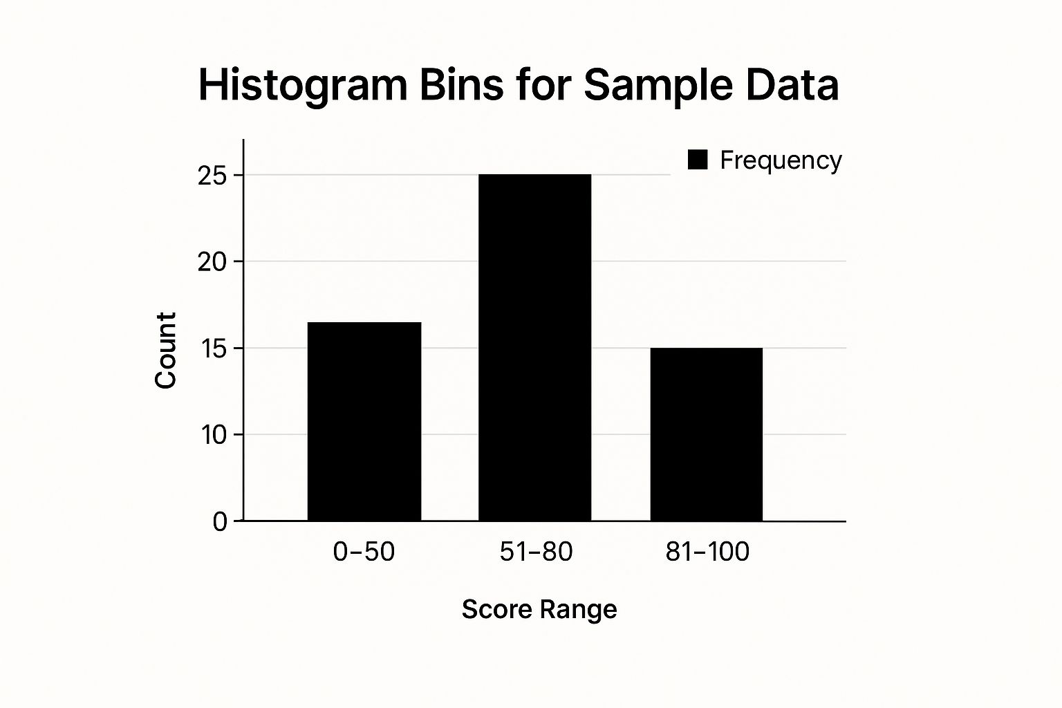
This infographic shows sample data grouped into three bins: 0-50, 51-80, and 81-100. The 51-80 range holds the most frequent value, with a count of 25. This suggests this score range is the most common in the dataset. This simple example illustrates how bin sizes impact our understanding of data distribution.
Choosing the right bin sizes within your histogram graph in Microsoft Excel is crucial for getting useful insights. While Excel offers automatic binning, understanding manual adjustments can greatly improve your analysis.
Optimizing Your Bins in Excel
Excel provides several ways to optimize bins, each with its own benefits. The automatic setting is a good place to start, but it's often not specific enough for detailed analysis.
- Custom formulas: These offer fine-grained control, letting you tailor bins to your exact requirements.
- Defined ranges: Creating defined ranges in a separate column and linking them to your histogram offers even more flexibility. This lets you try different bin sizes without manually changing the chart settings every time.
Choosing the Right Bin Width
Finding the right bin width is a common challenge. Bins that are too narrow create a noisy histogram, obscuring the overall data distribution. Bins that are too wide oversimplify the data, hiding important details. A good starting point is the square root of your sample size as a guide for the number of bins. However, this isn't a strict rule. The best bin width depends on factors like your dataset's characteristics, the sample size, and your analysis goals.
Expert Strategies for Bin Selection
Experienced analysts often develop their own bin selection strategies based on the kind of data they're working with. For example, when analyzing customer spending, an analyst might use smaller bins for lower purchase values to identify common spending brackets. They might use larger bins for higher values due to their lower frequency. This focuses attention where spending is concentrated. A trading journal template in Excel can also be useful for tracking and analyzing different types of data.
To better understand how professionals approach bin selection for various data types, review the table below:
To prepare your data effectively before generating histograms, explore helpful tips in our guide on data scrubbing techniques.
Strategic Bin Selection for Different Data Types
This table compares different approaches to setting bin sizes based on the nature of your data and analysis goals.
| Data Type | Recommended Bin Size Approach | Pros | Cons | Example Use Case |
|---|---|---|---|---|
| Customer Spending | Smaller bins for lower values, larger for higher | Highlights common spending brackets, accommodates outliers | Can obscure overall trends in spending if not carefully interpreted | Identifying typical purchase amounts |
| Website Traffic | Hourly or half-hourly bins | Reveals peak traffic times | Can be noisy with infrequent traffic; daily views might be more useful | Optimizing website content for peak hours |
| Exam Scores | Equal-width bins based on grading scales | Clearly displays distribution across grade ranges | May not capture nuanced performance within a specific grade range | Analyzing student performance on assessments |
| Temperature Readings | Consistent, small bins (e.g., 1 degree) | Tracks subtle temperature fluctuations | Can obscure long-term temperature trends | Monitoring climate change impacts |
This table illustrates how different binning strategies can provide focused insights based on the specific data being analyzed. Tailoring your bins allows you to uncover the true story within your data. By thinking beyond standard intervals, you'll see hidden trends and key insights that can help create more effective, data-driven strategies.
Transform Raw Histograms into Professional Visualizations
Creating a histogram in Microsoft Excel is just the starting point. The real power lies in transforming that basic chart into a polished, insightful visualization. It's similar to framing a masterpiece: the right frame enhances the art, a poor one detracts.
Choosing the Right Color Scheme
Color is a powerful tool for communication. A thoughtful color palette can highlight key patterns and make your Excel histogram more engaging. For instance, contrasting colors for different bins can draw attention to significant frequency differences.
Avoid using too many colors, however. This can create visual clutter and overwhelm the viewer. For optimal clarity, stick to a limited palette of two to three colors. Also, consider your audience and the presentation's context when selecting colors.
Customizing Axis Formatting
Axis labels and formatting provide crucial context for your Excel histogram. Clearly labeled axes ensure viewers understand the data's meaning. Consistent intervals and appropriate scaling prevent misinterpretations.
Consider adding gridlines if they enhance readability without cluttering the chart. Too many gridlines can be distracting, so use them sparingly.
Strategic Labeling and Annotations
Labels and annotations provide additional context, highlighting important data points. You could label specific bins with their frequency values or annotate significant trends.
Avoid overcrowding your histogram with too many labels, as this can lessen its impact. Focus on labeling key data points and providing concise explanations.
Removing Distracting Elements and Emphasizing Key Data Points
A clean, minimalist design helps your data shine. Removing unnecessary chart elements, such as borders or legends, can enhance clarity.
Consider emphasizing significant data points with bold text, highlighting, or other visual cues. This directs the viewer's attention to the most critical information. You might find helpful tips in this article: How to master data visualization best practices for impactful insights.
Incorporating Statistical Overlays
Adding statistical overlays, such as a normal distribution curve, can add deeper analytical context to your Excel histogram. This helps viewers understand how the data distribution compares to a theoretical ideal. If you're looking to expand your Excel visualization skills, explore resources on custom course development.
Before-and-After Makeovers
One of the best ways to learn effective data visualization is by analyzing before-and-after examples. Identify areas for improvement in poorly designed histograms.
Then, redesign these charts using the principles discussed above. This process helps you develop the design judgment to create compelling and insightful Excel histograms that resonate with both technical and non-technical audiences, presenting data in a way that is both visually appealing and easy to understand.
Handling Big Data: Histogram Techniques That Scale
Working with massive datasets in Excel can make creating histograms a real challenge. Standard methods might slow down or even crash. But don't worry, your analysis doesn't have to suffer. Let's explore some practical strategies for maintaining analytical integrity with large datasets.
Intelligent Sampling and Strategic Aggregation
One effective method is intelligent sampling. This means selecting a smaller, representative portion of your data that still reflects the overall distribution. For example, if you have millions of data points, a well-chosen sample of a few thousand can often give you accurate insights without overloading Excel.
Another helpful technique is strategic aggregation. This involves grouping data into broader categories before creating your histogram. This reduces the number of data points Excel needs to handle, which improves performance. For example, instead of individual sales, you might aggregate sales by day or week.
Leveraging PivotTables and the Data Analysis ToolPak
PivotTables are incredibly useful for managing large datasets in Excel. They can quickly summarize and group your data, making it much easier to create histograms. By letting PivotTables handle the heavy lifting, you can avoid performance problems caused by complex formulas or chart manipulations. For more on PivotTables, check out this resource: Excel Pivot Table Examples: Unlock Data Insights.
Excel's Data Analysis ToolPak also offers enhanced histogram features that handle larger datasets better than the standard charting tools. It gives you more control over binning (how data is grouped) and other settings, making it a great resource for in-depth histogram analysis.
Recognizing Excel's Limitations and Exploring Alternative Tools
While Excel is powerful, it does have limits. Consider this: a 2022 Microsoft Community forum post highlighted users encountering errors like "The range you selected is too large" when trying to create histograms with around 181,000 data points.
This shows that Excel's built-in histogram features, while useful, struggle with extremely large datasets. This often forces users to find other ways to manage the data, like breaking it down into smaller chunks, using sampling, or turning to external tools. It’s important to know when you've hit these limits.
When Excel starts to struggle, consider using specialized statistical software or data visualization tools designed for big data. These tools offer better performance and advanced features for handling and visualizing massive datasets, ensuring your analysis stays efficient and effective.
Beyond the Basics: Formula-Driven Histogram Techniques
Excel's built-in histogram chart is a helpful starting point for visualizing data distribution. But what if you need more advanced capabilities? Formula-driven techniques unlock a new level of control over your histograms, enabling dynamic visualizations tailored to your specific analytical needs.
Harnessing the Power of FREQUENCY(), COUNTIFS(), and Array Formulas
This section explores the power of Excel formulas for creating custom histograms. Functions like FREQUENCY(), COUNTIFS(), and array formulas offer greater flexibility than the standard chart options.
-
FREQUENCY(): This function efficiently categorizes data into specified bins, providing a quick overview of the distribution. It's ideal for creating initial histograms and understanding basic patterns in your data. -
COUNTIFS(): When you need conditional counting,COUNTIFS()is the right tool. It allows you to define multiple criteria for assigning data to bins, offering more granularity thanFREQUENCY(). This becomes especially useful when dealing with complex datasets. -
Array Formulas: These powerful formulas perform complex calculations across entire data ranges, enabling advanced histogram customization. With array formulas, you can automate calculations and create histograms that dynamically update as your data changes.
Let's explore how these formula-driven techniques can enhance your histogram creation process. To delve deeper into data automation, check out this resource: How to master automating data analysis for faster business insights.
To illustrate the strengths and weaknesses of each method, let's look at the following comparison:
To understand the key differences between these methods, take a look at this table:
Comparing Histogram Creation Methods in Excel This table compares different techniques for creating histograms in Excel, highlighting the advantages and limitations of each approach.
| Method | Excel Versions Compatible | Ease of Use | Customization Options | Performance with Large Data | Best For |
|---|---|---|---|---|---|
| Built-in Histogram Chart | 2016+ | Very Easy | Limited | Good | Quick, basic histograms |
FREQUENCY() Formula |
All versions | Easy | Moderate | Excellent | Efficient binning & distribution overview |
COUNTIFS() Formula |
2007+ | Medium | High | Good | Conditional binning & complex criteria |
| Array Formulas | All versions | Advanced | Very High | Moderate | Dynamic, highly customized histograms |
This table highlights the trade-offs between ease of use and customization. While the built-in chart is the simplest, formula-driven approaches offer significantly greater flexibility for tailored visualizations. FREQUENCY() stands out for its efficiency, particularly with larger datasets.
Creating Dynamic and Responsive Histograms
Formula-driven techniques empower you to create dynamic histograms that respond to data changes. Imagine a histogram that automatically updates its bin ranges based on user input or dynamically adjusts its visualization as new data is added. This responsiveness is invaluable for real-time analysis and exploration.
Adapting to Unique Analytical Requirements
Not all datasets fit neatly into standard histogram configurations. Some data might require non-uniform bin widths or custom bin boundaries. Formula-driven techniques offer the control needed to tailor visualizations to the specific characteristics of your data, accommodating unique analytical needs.
Practical Examples and Troubleshooting
This section will provide practical examples and downloadable templates. It will also offer troubleshooting guidance, such as handling FREQUENCY() errors and optimizing array formula performance. This hands-on approach will equip you with the skills to build formula-driven histograms. Additionally, we'll discuss optimization techniques to ensure efficiency, even with large datasets, ensuring your histograms remain valuable analytical tools.
Reading the Story Your Histogram Graph Excel Is Telling
Transforming your Excel histogram from a simple chart into a powerful analytical tool is key for data-driven decisions. This section explores how to interpret the shapes of your histograms and translate those visual patterns into actionable insights. You'll discover how professionals across diverse fields use histogram insights to spot market trends, fine-tune processes, and tackle potential issues before they become major problems.
Recognizing Key Distribution Patterns
The shape of your histogram paints a picture of your data. Recognizing key distribution patterns is essential for accurate interpretation. Here are three common patterns you'll encounter:
-
Normal Distribution: This familiar bell-shaped curve shows data clustered around the average. Frequencies symmetrically decrease as values move further from the mean. This pattern often appears in naturally occurring phenomena like height and weight distributions.
-
Skewed Distribution: A skewed histogram displays an imbalance, with one tail longer than the other. A right-skewed distribution (long tail on the right) suggests data concentrated at lower values with fewer higher occurrences. A left-skewed distribution (long tail on the left) indicates the opposite. Skewness is common in datasets like income levels or product review ratings.
-
Bimodal Distribution: This distinct pattern features two separate peaks, indicating two different data clusters. This often happens when two distinct groups are combined within a single dataset. For instance, measuring the heights of a mixed group of men and women would likely create a bimodal distribution. If you're interested in other Excel tips, consider checking out XLOOKUP vs. VLOOKUP: Which Excel Function Is Best for You?
Translating Patterns Into Actionable Insights
Understanding distribution patterns unlocks valuable business intelligence. For example, a marketing team analyzing customer purchase amounts might find a right-skewed distribution. This indicates that most purchases are relatively small, with fewer large transactions. This insight can inform pricing strategies, promotional offers, and how they segment their customers.
Furthermore, spotting a bimodal distribution could reveal an untapped market segment. Imagine a company analyzing customer satisfaction scores. A bimodal distribution might reveal two distinct customer groups: one highly satisfied and the other significantly less so. This allows for targeted interventions, addressing the dissatisfaction of one group while reinforcing the positive experiences of the other.
Communicating Histogram Findings to Stakeholders
Presenting histogram findings effectively is just as important as creating them. Adapting your communication style to your audience ensures your insights drive action. When presenting to technical teams, concentrate on statistical details and analytical methods. However, for executive leadership, highlight the key takeaways and strategic implications of your analysis.
One effective strategy is to use clear, concise language, avoiding technical jargon. Visual aids like annotated histograms and summary tables help present complex data in an easily digestible way. This ensures your analysis resonates with various stakeholders, leading to informed decisions and a positive impact on the organization. By mastering these communication techniques, you ensure your histogram insights contribute directly to strategic goals and overall success.
Ready to elevate your Excel skills and show off your spreadsheet style? Visit SumproductAddict today for a unique collection of Excel-themed apparel and accessories. Use code FIRSTORDER for 10% off your first purchase and let your Excel passion shine!