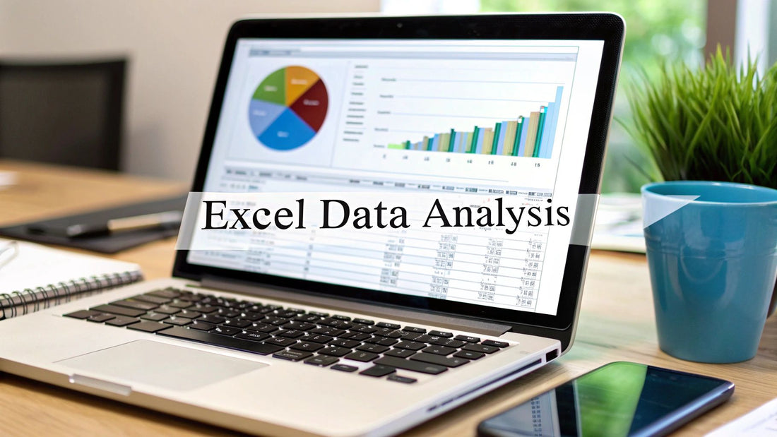
A Guide to Excel Data Analysis
When you hear "data analysis," your mind probably jumps to complex programming languages or expensive, specialized software. But what if I told you one of the most powerful data tools is already sitting on your desktop?
That’s right, I’m talking about Excel.
At its core, Excel data analysis is simply the process of taking raw, messy information and using Excel’s features to clean it, transform it, and model it until it tells a story. It's about turning a jumble of numbers into clear, actionable insights that can actually help you make better business decisions.
Why Excel Is Still Your Data Analysis Powerhouse
It's easy to dismiss Excel as a glorified list-maker, especially with all the fancy analytics platforms out there. But that's a huge mistake. For millions of professionals, Excel remains the go-to workhorse for serious data analysis, handling the entire process from start to finish.
Think of Excel as your all-in-one analytics studio. It’s where chaotic data gets a much-needed deep clean, where it’s organized into a sensible structure, and where it’s ultimately shaped into a compelling visual narrative. This guide is designed to take you from a casual spreadsheet user to a confident analyst who can spot trends and drive decisions—no expensive software required.
From Basic Spreadsheets to Business Intelligence
Getting good at Excel data analysis isn't about memorizing hundreds of obscure formulas. It’s about deeply understanding a core set of tools and learning how they connect to solve real-world problems. The goal is to start thinking like an analyst—asking the right questions and then using Excel to dig up the answers.
This really comes down to mastering three key stages:
- Data Preparation: This is ground zero. You'll learn how to wrangle chaotic datasets, because you can't trust your analysis if your data is a mess.
- Data Exploration: Here, you'll use tools like functions and PivotTables to slice, dice, and summarize your data to uncover those hidden patterns.
- Data Visualization: Finally, you'll create clean, insightful charts and dashboards that clearly communicate your findings to anyone, from your boss to your clients.
The real magic of Excel is its blend of power and accessibility. It's a practical entry point into the world of data analysis, letting you build a solid analytical foundation without a steep learning curve or a big budget.
A Versatile Tool for Modern Analytics
Even hardcore data scientists who live in Python or R still keep Excel in their back pocket. Why? Because its ability to quickly gather, clean, and perform initial exploratory analysis is second to none. Plus, with modern features designed for automation, it can chew through repetitive tasks and handle surprisingly large datasets more efficiently than ever.
This flexibility is critical. Not every organization has the budget for a high-end analytics platform, which makes Excel an indispensable part of the modern data toolkit. You can see countless examples of how Excel is still used for real-world analytics on YouTube.
By mastering the techniques in this guide, you’ll unlock what Excel is truly capable of. You'll go far beyond basic calculations to build dynamic, insightful reports that answer tough business questions and turn your spreadsheets into a genuine source of competitive advantage.
Of course! Here is the rewritten section, crafted to sound like it was written by an experienced human expert, following all your specified requirements.
Getting a Grip on Excel’s Most Powerful Analysis Functions
To really get anywhere with Excel data analysis, you have to look past the basics like SUM and AVERAGE. The real magic happens when you master a handful of core functions that act like a Swiss Army knife for your data, letting you ask complex questions and get clear answers.
Think of these functions less like rigid formulas and more like recipes. We're not just going to list them; we'll get into the why behind each one. This is how you go from someone who just copies and pastes formulas to an analyst who knows exactly which tool to grab for the job.
Making Decisions with Logical Functions
At its core, analysis is all about making decisions. Logical functions like IF, AND, and OR are your way of building rules right into your spreadsheet, telling Excel how to think and react based on your data.
The IF function is the foundation. It’s simple: it checks if something is true or false and then does one of two things you tell it to. Say you have a list of sales reps and their monthly figures. You can use IF to instantly flag who gets a bonus.
=IF(C2>50000, "Bonus", "No Bonus")
This little formula looks at the sales total in cell C2. Is it more than $50,000? Great, it returns "Bonus." If not, it returns "No Bonus." Simple as that.
But what if a bonus has more than one requirement? That’s where AND and OR come in. You can tuck them inside an IF function for more sophisticated rules. Maybe a rep needs sales over $50,000 and more than 10 new clients. Combining these functions lets you automate those kinds of real-world business rules without breaking a sweat.
Finding What You Need with Lookup Functions
Lookup functions are your data librarians. You hand them one piece of info (like an employee ID), and they'll instantly scan a massive table to find what you're looking for (like that employee's department).
For a long time, VLOOKUP was the go-to function for this. It looks down the first column of a table for your value and grabs a related piece of data from another column. It's a workhorse, for sure, but it has its frustrations—like its rigid insistence on only looking from left to right.
Enter its modern replacement: XLOOKUP. If you have Excel 365, this is the function you should be using. It’s more powerful, far more flexible, and honestly, just easier to write. It can look in any direction—left, right, up, or down.
XLOOKUP is flat-out better than VLOOKUP and HLOOKUP. It makes finding data simpler, handles errors with more grace, and doesn't box you in like its predecessors. For any analyst working in Excel today, it's a must-know.
Let's imagine you need to find an employee's department using their ID number.
- The VLOOKUP way: You'd have to make sure the ID column is the very first column in your data range.
- The XLOOKUP way: The ID column can be anywhere. This freedom alone is a massive quality-of-life improvement.
If you're starting out with Excel analysis today, make learning XLOOKUP a priority. For a handy guide to these and other essential formulas, our Excel formulas cheat sheet provides an excellent resource to get you up to speed.
Adding Things Up (With Conditions)
SUM and COUNT are fine, but their real power is unlocked when you can be selective. What if you only want to sum sales from a specific region? This is exactly what conditional aggregation functions like SUMIFS, COUNTIFS, and AVERAGEIFS were built for.
I like to think of SUMIFS like a smart coin counter. You can tell it to only give you the total value of quarters that were minted after 1999. It sums things up, but only if they meet the specific criteria you set.
In a business context, you could use SUMIFS to find the total revenue for a single product line, sold in the West region, during Q4. This ability to layer multiple filters is what makes these functions essential for building insightful reports and dashboards.
Cleaning Up Messy Data with Text Functions
Let's be honest: no analysis starts with perfectly clean data. More often, it's a mess. Text functions are your cleanup crew, helping you standardize inconsistent text before you start your analysis.
- TRIM: Gets rid of those annoying extra spaces at the beginning, end, or middle of your text.
- PROPER, UPPER, LOWER: Instantly change text to Title Case, ALL CAPS, or all lowercase.
- CONCATENATE (&): The quickest way to join text from different cells, like combining a first and last name.
- LEFT, RIGHT, MID: Lets you pull out a certain number of characters from the start, end, or middle of a cell.
These functions are the unsung heroes of data prep. You’ll use them to standardize customer names that were entered differently, pull a zip code out of a full address, or create unique IDs. Getting comfortable with these tools ensures your data is solid and ready for the real analysis ahead.
How to Clean and Organize Data for Analysis
Before you can dream of finding a single insight or building a slick chart, you have to face the music: data preparation. This entire process boils down to one simple, unbreakable rule—garbage in, garbage out. If your source data is a tangled mess, your analysis will be useless.
Think of it like being a chef. You wouldn't just toss dirty vegetables and mismatched ingredients into a pot and expect a Michelin-star meal. The same goes for data. An analyst’s first job is to clean house, turning a chaotic spreadsheet into something pristine and ready for action. It’s the only way to trust the results.
Let’s get real. Imagine you’ve been handed a customer list pulled from three different systems. It’s a complete disaster. Names are crammed into one cell, state abbreviations are all over the place ("CA," "Calif.," "California"), and you’re seeing double with duplicate entries.
Here’s how you can whip it into shape using Excel's built-in tools.
Splitting and Standardizing Your Data
First up, that Full Name and Address data stuck in single cells. This makes sorting or filtering by name or city impossible. This is a classic data cleaning headache, and Text to Columns is the perfect cure. It acts like a precision knife, slicing text from one cell into several columns based on a delimiter you choose, like a comma or space.
For example, you can instantly turn "John Smith, 123 Main St" into separate, usable columns for Name and Address. Your data is immediately more structured.
Next, you spot those inconsistent state entries. To do any kind of regional analysis, they all need to be the same. The Find and Replace feature is your best friend here. You can quickly hunt down every variation of "California" and swap it for the standard "CA," bringing consistency to your entire dataset in seconds.
Ensuring Data Integrity and Accuracy
With your data split and standardized, it's time to hunt down duplicates. Having the same customer listed multiple times will completely throw off your counts and totals, leading you to the wrong conclusions.
Thankfully, Excel’s Remove Duplicates tool is a one-click wonder. Just select your data, click the button, and watch the redundant rows disappear. This simple move is absolutely vital for maintaining the integrity of your analysis. If you really want to get serious, there are some powerful data scrubbing techniques you can master to ensure pristine data.
Data cleaning isn't just some boring chore you do before the "real" work begins—it is the real work. Studies have shown that data scientists can spend up to 80% of their time just cleaning and preparing data. That tells you everything you need to know about how critical this stage is.
Your Secret Weapon for Reformatting
Now for a tool that honestly feels like magic: Flash Fill. This is your secret weapon for reformatting data on the fly, no formulas needed. Flash Fill is smart; it watches what you do, detects the pattern, and offers to complete the entire column for you.
Let’s say you have a column with names in a LAST, FIRST format (like "Smith, John") and you want a new column that reads FIRST LAST ("John Smith").
- In a new, adjacent column, just manually type the first name how you want it: "John Smith".
- Start typing the second entry in the next row down, "Jane Doe".
- Before you even finish, Excel will recognize what you're doing and show a grayed-out preview of the rest of the column filled out perfectly. Just hit Enter, and the job is done.
It works for all sorts of things, like pulling initials from names or extracting phone numbers from a messy text block. By mastering these core cleaning tools, you transform a chaotic dataset into a powerful asset, setting the stage for truly accurate and insightful excel data analysis.
Finding Hidden Trends with PivotTables
So, your data is clean and organized. Now for the fun part: asking questions. But staring at thousands of rows of raw data is like trying to find a needle in a haystack. How do you actually explore it without getting lost in an endless sea of cells?
This is where one of the most powerful tools in all of Excel data analysis comes in: the PivotTable.
If formulas are your precision scalpels, a PivotTable is your all-terrain exploration vehicle. It's an interactive summary table that lets you slice, dice, twist, and turn your data with a simple drag-and-drop interface. In mere seconds, you can transform a massive, flat table into a clear, understandable report—all without typing a single formula.
It's hands-down the fastest way to go from a wall of numbers to a multi-dimensional view that reveals the patterns and trends hiding just beneath the surface.
Building Your First PivotTable
Creating a PivotTable is surprisingly painless. You start with a well-structured table of data (make sure there are no blank rows or columns). Just click any cell inside your data, then head to Insert > PivotTable.
Excel will pop open a new sheet with the PivotTable Fields pane on the right. This little pane is your command center for the entire analysis.
To get started, you just need to understand the four boxes in this pane. They are the heart and soul of every PivotTable you'll ever build.
Let's quickly break down the core components of a PivotTable. Understanding what goes where is the key to unlocking its power.
Core Components of a PivotTable
| PivotTable Area | Purpose and Function | Example Usage |
|---|---|---|
| Filters | Applies a high-level filter to the entire table. Think of it as the main lens for your analysis. | Filtering the entire report to show data for only "North America" or "2023". |
| Columns | Fields placed here become the column headers, running horizontally across the top of your table. | Perfect for time-based data like months or quarters, creating a timeline view. |
| Rows | Fields dragged here create the row labels, running vertically down the side of your table. | Ideal for categorical data like "Product Name," "Customer Segment," or "Store Location." |
| Values | This is the engine room. Any field you drop here gets calculated. | This is where your numbers go, like a SUM of Sales, a COUNT of Orders, or an AVERAGE Transaction Value. |
By simply dragging your data fields into these four boxes, you instantly get a summary. Want to see sales by region? Drag "Region" to Rows and "Sales" to Values. Boom, done. For a deeper dive, there are tons of great Excel PivotTable examples that unlock data insights that can show you just what's possible.
Grouping Data to Reveal Trends
One of the slickest features of a PivotTable is its ability to group data on the fly. Let's say you have a column full of daily sales dates. Analyzing each day one-by-one is tedious and rarely useful.
Instead, you can just right-click on any date inside your PivotTable and select "Group."
A dialog box will appear, letting you bundle that granular data into much more meaningful chunks, such as:
- Months
- Quarters
- Years
This one simple action transforms a long list of daily figures into a high-level summary that immediately shows you seasonal trends or year-over-year growth. You can do the same thing with numbers, too—like grouping customers by age brackets to better understand your audience.
A PivotTable doesn't change your original data; it simply creates a dynamic new view of it. This makes it a safe and powerful environment for experimentation. You can drag and drop fields, add filters, and change calculations without any fear of messing up your source information.
Making Your Analysis Interactive
A static report is fine, but an interactive one is a game-changer. This is where Slicers and Timelines enter the picture. Think of these as beautiful, user-friendly visual filters that turn your PivotTable into a mini-dashboard. Instead of fiddling with clunky drop-down menus, you can create clear, clickable buttons that anyone can use.
- Slicers: These are perfect for filtering by categories. Imagine having buttons for each "Region," "Product," or "Sales Rep." A colleague can just click a button, and the PivotTable instantly updates to show data for only that selection.
- Timelines: This is a special type of slicer built just for dates. It gives you a sleek, visual way to filter your report by years, quarters, months, or even days with a simple slider.
Here’s a quick look at the most common chart types people pair with their PivotTables to bring the data to life.
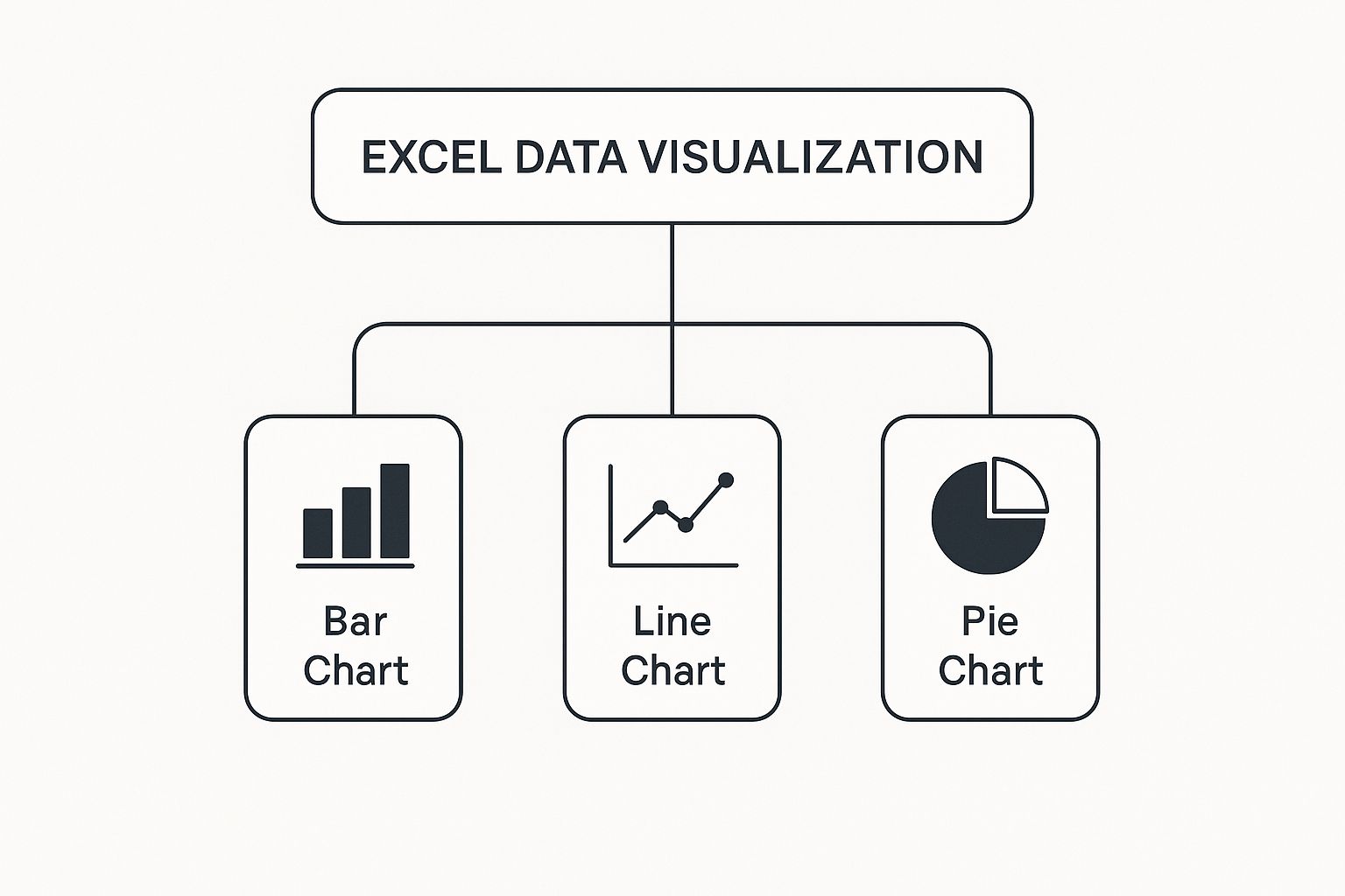
These fundamental charts are often the final step in turning your PivotTable analysis into a visual story.
By adding Slicers and Timelines, you're not just presenting data; you're delivering an interactive analytical tool. You empower your boss or teammates to answer their own questions, explore different scenarios, and find the insights they need without having to come back to you for a dozen different versions. This is how your excel data analysis goes from being a static snapshot to a living story that invites everyone to explore.
Automating Data Prep with Power Query
If you've ever found yourself stuck in a loop, performing the same mind-numbing data cleaning steps month after month, you’re about to meet your new best friend. Power Query is Excel's built-in engine designed to make repetitive, manual data prep a thing of the past. For anyone serious about Excel data analysis, it's a genuine game-changer.
Think of Power Query as a "recipe" for your data. You show it how to clean, shape, and transform your information just once. After that, it follows your instructions perfectly every single time you hit refresh, saving you countless hours and eliminating the risk of human error.
This is about building a repeatable, bulletproof workflow. It’s the difference between manually cooking a meal every night and having a master chef who has memorized your favorite recipe and prepares it flawlessly on command.
Your First Data Transformation Recipe
Let's tackle a classic business headache: combining a folder of monthly sales reports into a single master file. The old-school way involves painstakingly opening each file, then copying and pasting the data. That process isn't just slow—it's an open invitation for mistakes.
With Power Query, you can automate the entire thing. You simply point it to a folder containing all your monthly Excel or CSV files, and it gets to work building a clean, consolidated table based on the steps you define.
Here are the kinds of powerful steps you can add to your recipe:
- Combine Files: Automatically pull data from every file in a folder and merge it into one table.
- Remove Unnecessary Columns: Declutter your dataset by keeping only the columns you actually need.
- Filter Out Rows: Set rules to remove irrelevant information, like sales from a specific region or orders below a certain value.
- Change Data Types: Make sure columns are properly formatted as numbers, dates, or text so your calculations are always accurate.
Once you build this query, next month's report becomes a simple matter of dropping the new file into the folder and clicking "Refresh." Power Query does the rest. For a more detailed guide, this Excel Power Query tutorial can help you master data transformation.
Advanced Shaping and Merging
Power Query’s magic goes far beyond just combining files. It truly shines when you need to reshape data into a format that’s ready for analysis—a task that would be a nightmare with traditional formulas. One of its most powerful tools for this is Unpivot Columns.
Imagine your data is laid out in a "wide" format, with years as column headers and sales figures underneath. This structure is easy for people to read, but it’s terrible for tools like PivotTables.
With just a few clicks, Unpivot transforms this wide table into a "tall," analysis-friendly one. It turns all those year columns into just two new columns: one for the attribute (like "Year") and one for the value ("Sales"). This single move makes your data instantly ready for robust analysis.
Power Query is also brilliant at bringing data together from different sources. You can easily merge or append information from various places, such as:
- An Excel table in your workbook
- An external database
- A website or SharePoint list
This allows you to create one unified dataset, like joining your sales data with customer details from a CRM export. It acts as a central hub for all your data, prepping it perfectly before it even gets to your report or PivotTable. Best of all, the entire process is recorded as a series of clear, editable steps, giving you a transparent log of every single transformation.
Telling Your Data's Story with Charts
So, you’ve wrestled with your data, cleaned it up, and uncovered some fantastic insights. That's a huge win. But a brilliant analysis is only half the battle—if nobody understands what you’ve found, it might as well have never happened.
This is where you stop being a data cruncher and start being a storyteller. Raw numbers and dense tables can make people’s eyes glaze over. A great chart, on the other hand, hooks them in. It acts as a bridge, turning all your hard work into a clear, persuasive narrative that makes people listen.
Choosing the Right Chart for Your Message
The first rule of thumb is simple: not all charts are created equal. Picking the right one is about matching the visual to the message. If you get this wrong, you risk confusing your audience or, even worse, leading them to the wrong conclusion. It’s that important.
Here’s a quick rundown to help you make the right call:
- Bar Charts: These are your go-to for comparing different groups or categories. Think sales totals by region or website visits by marketing channel. They make direct comparisons incredibly clear.
- Line Charts: Perfect for showing how something changes over time. Use a line chart to track things like monthly revenue, stock performance, or website traffic to instantly show a trend.
- Pie Charts: Use these with caution. They're only effective for showing parts of a whole when you have just a handful of distinct categories, like market share between two or three top competitors.
- Scatter Plots: These are for exploring relationships. If you want to see if there's a connection between two different numbers—like ad spend vs. sales, or employee training hours vs. performance—a scatter plot is the tool for the job.
Choosing correctly is fundamental to getting your point across. For a much deeper look, our Excel charts and graphs tutorial offers a fantastic guide to creating visuals that truly resonate.
Designing Charts for Clarity and Impact
Once you’ve selected the right chart type, you need to polish it. This isn't about adding flashy 3D effects or a rainbow of colors. In fact, it’s about the exact opposite: strategic subtraction.
A great chart gets its point across with clarity, precision, and efficiency. Every single element on that chart—every line, label, and color—should have a reason for being there. If it doesn't add to the story, get rid of it.
Start by decluttering. Remove distracting gridlines, borders, and shadows that don't add value. Be intentional with color. Instead of just making things pretty, use a neutral color for your baseline data and a single, bold accent color to draw your audience's eye directly to the most important insight.
Finally, give your chart a title that tells a story. A generic title like "Quarterly Sales" is a missed opportunity. Try something like, "Q3 Sales Grew 15% Following New Product Launch." This gives your audience the main takeaway before they even dive into the numbers.
Mastering these skills is more valuable than ever. The entire data analytics market is projected to skyrocket from around USD 50 billion in 2024 to over USD 658.6 billion by 2034. You can read the full research about these data analytics market trends to see just how big this field is getting. By focusing on clear storytelling, you ensure your analysis doesn’t just get seen—it gets understood and acted on.
Got Questions About Excel Data Analysis?
Even after you've got a handle on the basics, you're bound to run into a few head-scratchers. It happens to everyone. Let's tackle some of the most common questions that pop up when you're deep in the data.
What's the Real Difference Between a Formula and a Function?
This is a big one, and it trips up more people than you'd think. It's actually pretty simple when you break it down.
- A function is a pre-built shortcut Excel gives you. Think of things like
SUM,AVERAGE, or the dreadedVLOOKUP. They have a name and do one specific job. - A formula is the entire command you type into a cell. It always starts with an equals sign (
=) and tells Excel what to calculate.
So, =SUM(A1:A10) is a formula that happens to use the SUM function. But =A1+B1 is also a formula, even though it doesn't use any functions at all. Every function lives inside a formula, but not every formula needs a function to get the job done.
Think of it like this: a function is a power tool (like a drill), while a formula is the full instruction ("use the drill to put a screw right here"). Getting this down is the first step to building more powerful and complex spreadsheets.
Is Excel Even Relevant Anymore with Tools Like Python and R?
Yes, 100%. Don't let the code-gurus tell you otherwise.
While programming languages like Python and R are absolute beasts for heavy-duty statistics and machine learning, Excel still reigns supreme in its own territory. Nothing beats its speed and accessibility for quick, on-the-fly analysis, cleaning up messy data, or whipping up a chart for tomorrow's meeting.
Better yet, Excel isn't standing still. Microsoft recently rolled out Python in Excel, letting you run powerful Python scripts right inside your workbook. This isn't a case of one tool replacing another; it's about Excel evolving and integrating with them. It proves Excel is more essential than ever.
When Should I Bother with a PivotTable Instead of Just Using Formulas?
Great question. It's all about what you're trying to do.
You should reach for a PivotTable when you need to explore, summarize, and play with your data. Need to quickly group sales by region, see monthly totals, or just slice and dice your numbers to find hidden trends? A PivotTable lets you do that in seconds, without writing a single complex SUMIFS or COUNTIFS. It’s built for interactive discovery.
Stick with formulas when you need a precise, fixed calculation that's part of a bigger model. If your calculation is highly specific or needs to be a permanent part of your worksheet's structure, formulas give you that control.
Ready to show off your data skills in style? Check out the hilarious and clever Excel-themed apparel and accessories at SumproductAddict. From VLOOKUP hoodies to PivotTable desk mats, we've got the perfect gear for every spreadsheet enthusiast. Shop the collection and wear your nerdiness with pride!