
Excel Charts and Graphs Tutorial: Visual Data Mastery Guide
Setting Up Your Data for Chart Success
Jumping straight into creating a visual from messy data is like trying to build a house on a shaky foundation—it’s destined to be confusing and unstable. Before you even think about which chart type to choose, the most important step is preparing your data. This is where professional-looking, clear visualizations are made. The goal is to structure your numbers in a way that Excel intuitively understands, making the actual chart creation process smooth and preventing frustrating errors.
Why Your Data Structure Is Everything
Think of your spreadsheet as the script for your data's story. If the script is jumbled, the performance will be a disaster. A marketing pro tracking campaign performance, for instance, needs clean, distinct columns: 'Campaign Name,' 'Spend,' 'Impressions,' and 'Conversions.' Without this clear separation, Excel might misinterpret which numbers belong to which labels, leading to a chart that tells the wrong story.
This organized approach is even more critical in finance. An analyst tracking quarterly revenue must ensure their data is structured with clear headers like 'Quarter,' 'Product Line,' and 'Revenue.' This prevents Excel from getting confused by merged cells, blank rows, or mixed data types (like text and numbers in the same column), which are common culprits behind broken charts. For a deeper look into tidying up your worksheets, check out this guide on how to clean data in Excel.
Here’s an example of a well-organized dataset, ready for charting.
Notice how each piece of information has its own cell, with clear, concise headers at the top of each column. This simple, tabular format is the gold standard for effortless chart creation.
Before you start building any chart, it’s a great idea to run through a quick check to make sure your data is set up correctly. This table breaks down the essentials for organizing your data and points out common mistakes that can derail your efforts.
| Data Element | Best Practice | Common Mistake | Impact on Charts |
|---|---|---|---|
| Headers | Use a single row of unique, descriptive headers. | Merging cells for a main title over multiple columns. | Excel won't recognize individual data series, leading to incorrect labels or a failed chart. |
| Data Layout | Organize data in a simple, tabular format (columns and rows). | Leaving blank rows or columns to create visual separation. | This can cause Excel to select only a portion of your data for the chart, ignoring the rest. |
| Data Types | Keep data types consistent within a column (e.g., all numbers). | Mixing text and numbers in a single column meant for values. | Calculations can fail, and chart axes will not scale properly, distorting your visual. |
| Totals | Exclude summary rows (like 'Total' or 'Average') from your initial selection. | Including a 'Total' row when creating the chart. | Skews the scale dramatically, making individual data points almost impossible to compare. |
Taking a minute to review this checklist can save you a ton of time troubleshooting later. Clean data is the foundation of every great chart, ensuring your visuals are both accurate and easy to understand.
Matching Your Data Story With the Perfect Chart Type
Choosing the right chart is where your data's story either comes to life or falls flat. Pick the wrong visual, and you risk confusing your audience and burying your main point, no matter how solid your numbers are. It’s less about following rigid rules and more about developing an intuition for which format best serves your message. A simple line chart, for example, is perfect for showing a trend over time, like tracking monthly website traffic, in a way a bar chart just can't.
This decision is a fundamental part of any Excel charts and graphs tutorial. The goal is to match the chart's function to your communication goal. Are you comparing values between different groups? A column or bar chart is your best friend. Trying to show how different parts contribute to a whole? A pie chart can work, but only with a few categories—any more and it becomes a confusing mess. For exploring relationships between two different variables, like ad spend versus sales, a scatter plot is the clear winner.
To help you make the right call, I've put together a quick reference guide. This table breaks down common chart types and when to use them.
Chart Type Selection Guide
Quick reference for choosing the right chart type based on your data and analysis goals
| Chart Type | Best Used For | Data Requirements | Avoid When |
|---|---|---|---|
| Column/Bar Chart | Comparing values across categories. | Categorical data (e.g., products, regions) and corresponding numerical values. | Showing trends over a long time period or when categories are parts of a whole. |
| Line Chart | Showing trends and changes over time. | Time-series data (e.g., dates, months, years) with corresponding values. | You have non-sequential categories or are comparing many unrelated datasets. |
| Pie Chart | Displaying composition or parts of a whole. | Percentages or proportional data that adds up to 100%. Best with 2-5 categories. | You have more than 5-6 categories, or the parts don't add up to a meaningful whole. |
| Scatter Plot | Identifying relationships and correlations between two variables. | Two sets of corresponding numerical data (e.g., height and weight). | You are trying to compare categories or show composition. |
| Area Chart | Showing volume changes over time, emphasizing the magnitude of change. | Time-series data, similar to a line chart but with the area below the line filled in. | The data overlaps, which can obscure values and make interpretation difficult. |
| Histogram | Showing the frequency distribution of a dataset. | A single set of numerical data grouped into intervals or "bins." | You want to compare values across distinct categories (use a bar chart instead). |
This table should give you a solid starting point. The main takeaway is to think about your story first, then pick the chart that tells it best.
A Framework for Chart Selection
To take the guesswork out of this process, many analysts rely on a simple decision-making framework. This infographic breaks down the core logic: start with your data's purpose and follow the path to the ideal chart.
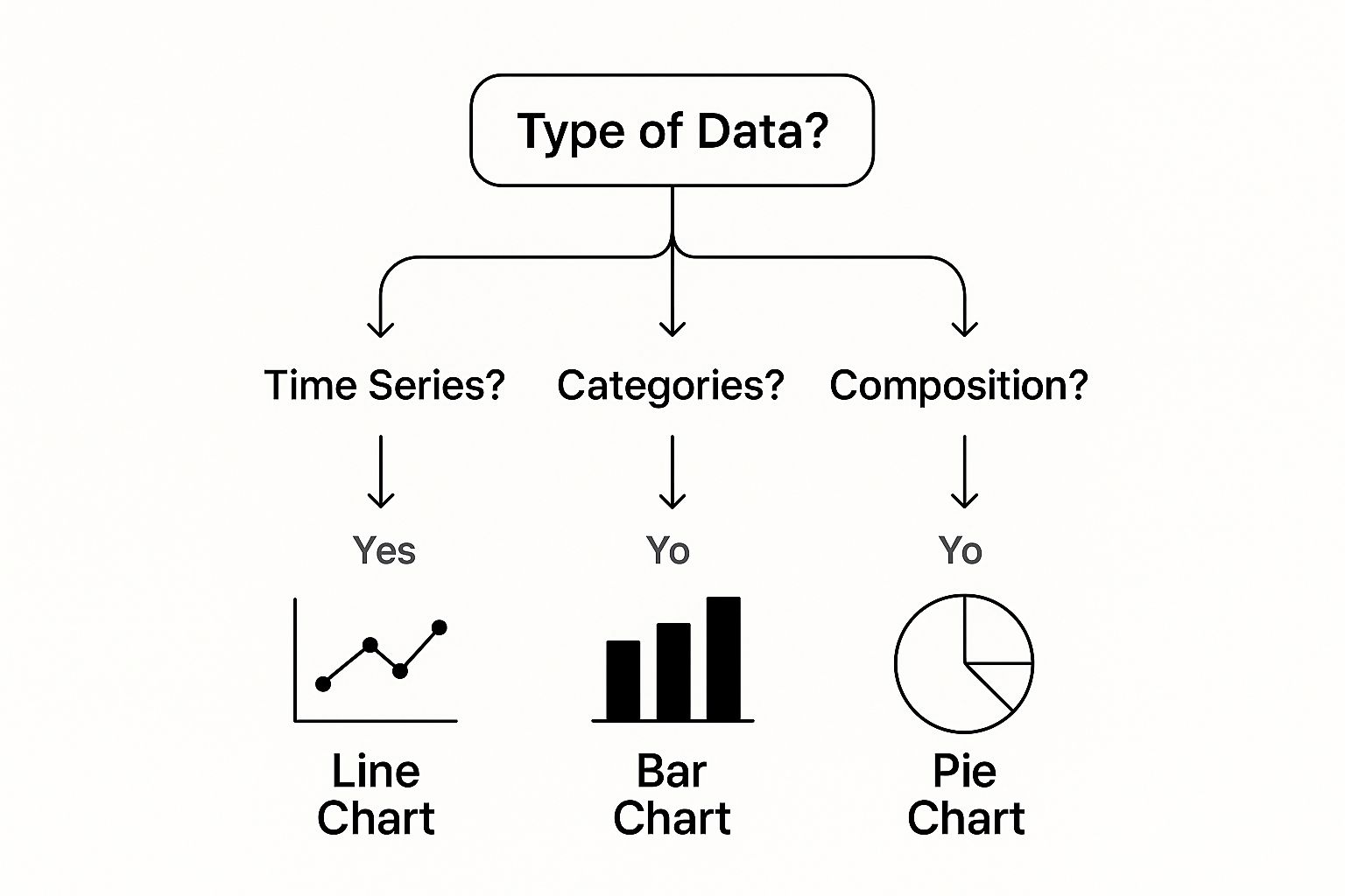
This visual guide connects your data’s narrative—whether it's tracking change, comparing items, or showing composition—to a specific chart type. Having this mental map is a huge step toward creating more effective visuals. If you want to dive deeper, our guide on data visualization best practices offers more advanced strategies.
The Power of Excel's Built-in Options
Since its release in 1985, Microsoft Excel has become the go-to tool for an estimated 1.1 to 1.5 billion users worldwide. This widespread adoption across finance, marketing, and logistics is a testament to its power in data management. A huge part of this is its extensive library of charting options, from clustered column charts to histograms, each designed for a specific analytical task. You can explore more about these options and find the right one for your analysis by looking into the variety of charts available in Excel.
The sheer number of choices can feel like a lot, but they all serve a purpose. The key is to experiment. What works for one dataset might not work for another. Don't be afraid to try a few different types to see which one tells your story most clearly.
Building Your First Professional Chart From Scratch
It's time to get our hands dirty and build a chart from the ground up. Most tutorials show you the simple "select your data, click insert" method, but that's just scratching the surface. Creating a professional chart is a craft, and it starts with understanding Excel's tools on a deeper level. We'll walk through a real-world scenario to show you the techniques that turn a basic graph into something truly insightful.
Let's put ourselves in the shoes of a marketing manager. You're analyzing monthly lead generation from three channels: Organic Search, Paid Ads, and Social Media. Your data is organized perfectly in a table, just like we discussed. The next step isn't just to make any chart; it's about creating one with intention and speed.
From Data to Draft in Seconds
The absolute fastest way to get a chart on your screen is with a keyboard shortcut. Once you've highlighted your data range (headers and all), just press Alt + F1 on Windows or Fn + Option + F1 on a Mac. This command instantly drops Excel's default chart—usually a clustered column chart—right onto your worksheet. This simple trick can speed up your workflow by 50% compared to fiddling with the mouse and menus.
You now have a basic chart, but it’s a long way from being finished. This is what you'll probably see after using the shortcut.
This initial draft is functional, sure, but it's also generic. A common mistake is accepting Excel's default settings as the final product. This is where most people stop, but it's where the real work of creating a clear and compelling visual begins.
Mastering the Chart Tools Ribbon
As soon as you select your new chart, two contextual tabs will pop up on your ribbon: Chart Design and Format. This is your new command center. Instead of clicking around randomly, let's be strategic. The Chart Design tab is your first port of call. Here are the most important tools to know:
- Add Chart Element: This dropdown is your best friend for precisely adding or removing titles, data labels, legends, and gridlines. It gives you far more control than the little "+" icon that floats next to the chart.
- Switch Row/Column: Did Excel get it wrong? If your months are showing up in the legend instead of along the X-axis, one click here almost always fixes it. It's a lifesaver.
- Change Chart Type: Have you realized that a line chart would tell a better story about trends over time? You can swap the chart type right here without losing your data or starting from scratch.
By focusing on these core functions, you can quickly shape the fundamental structure of your visual. This process turns your raw output into a clear narrative, setting the stage for more detailed formatting. If you're keen to see how these foundational skills apply to bigger projects, our guide on how to create an Excel dashboard shows you how to combine multiple charts into a single, dynamic view.
Professional Formatting That Commands Attention
Creating a chart is just the first step. The real magic happens when you format it to tell a story. This is where a standard, forgettable graph becomes a polished visual that makes your audience sit up and pay attention. It’s not about making things pretty for the sake of it; smart formatting choices guide your audience to the conclusion you want them to see.
This screenshot shows the powerful Format Data Labels pane, which is your command center for tweaking how values show up on your chart. Getting comfortable with these options—from custom number formats to label positioning—is essential for making your charts clear and professional.
Color and Typography: The Unsung Heroes
Your color choices can either lead your audience to the key insight or create a confusing mess. Think of color as a spotlight. Instead of accepting Excel's default rainbow palette, try using a neutral color like gray for most data points and a single, bold color to highlight the most important series. This is a favorite trick of data visualization experts because it instantly draws the eye to what matters.
A good rule of thumb is to:
- Use brand colors for reports you're sharing externally. It keeps everything looking professional and consistent.
- Pick one vibrant color to make your most critical data point pop.
- Stick to muted, neutral tones for everything else to keep the chart clean and uncluttered.
Typography also makes a huge difference in how readable your chart is. I always bump up the font size for axis labels and titles from the tiny default—it makes the chart instantly more accessible. A clean, sans-serif font like Calibri or Arial gives it a modern, easy-to-read look. Never underestimate the power of clear labels.
Advanced Formatting for a Polished Finish
Once your colors and fonts are sorted, a few subtle touches can really elevate your work. Custom number formats, for instance, can make your data much easier to understand. Instead of displaying a long number like $5,432,100, you can format the axis to show $5.4M. It’s cleaner and quicker to grasp. You can find this by right-clicking an axis and choosing Format Axis.
Another technique I like is using soft gradient fills on bars or columns. A gentle, two-tone gradient can add depth and a professional feel without being distracting. The key is to be subtle—you want a polished look, not a flashy effect that overpowers the data itself.
This focus on strategic formatting is a big part of effective data literacy. The use and teaching of Excel charts and graphs have become vital in business training, with many advanced tutorials covering tools like the Analysis ToolPak for more complex statistical charting. The best advice is always to pick the right chart first and then format it to tell a clear story. To dig deeper into this, you can find valuable insights on Excel for statistical analysis here.
Creating Charts That Update Themselves
Static charts are a dead end in any real business scenario. Think about your sales reports or financial dashboards—that data is constantly changing. Manually resizing your chart’s data source every time you add a new row is not just a chore; it’s a recipe for mistakes. The solution is to build dynamic charts that automatically include new data, saving you time and ensuring your visuals are always current.
The secret isn't some complex macro. It’s one of Excel's most powerful features: Excel Tables. When you format your data as a table (just select your data and press Ctrl + T), any chart based on that table becomes instantly dynamic. As you add new rows or columns, the table expands, and so does your chart’s data range. This one move is the foundation of almost every professional dashboard I've ever built.
Using Named Ranges and Formulas for Advanced Control
For even more flexibility, especially when building interactive dashboard elements, you can turn to dynamic named ranges. These are special named ranges that use formulas—often with the OFFSET and COUNTA functions—to define a data range that automatically grows or shrinks as your data changes.
Imagine creating a named range called Last12Months that always points to the last 12 rows of your sales data, no matter how much new data you add. Your chart's source could simply be =Last12Months, creating a rolling 12-month view without any manual updates. You can learn more about these powerful techniques in our guide to automating data analysis for faster business insights.
This leads us to the ultimate tool for dynamic visuals: PivotCharts. These charts are directly linked to PivotTables and have built-in filtering capabilities right out of the box.
The image above shows a PivotChart with interactive filter buttons for "Market" and "Product" placed directly on the chart. These slicers let anyone viewing the report instantly filter the data and explore different perspectives, turning a simple chart into an analytical tool. This approach is essential for building user-friendly dashboards where people can explore the data themselves.
After a quick refresh, the PivotChart reflects all new data from its source, combining automation with powerful user interaction. Mastering this moves you beyond a basic Excel charts and graphs tutorial and into the world of business intelligence.
Solving the Most Frustrating Chart Problems
We’ve all been there. You follow an Excel charts and graphs tutorial step-by-step, but your final chart looks like a Jackson Pollock painting—a confusing mess. From data that vanishes into thin air to formatting that just won’t cooperate, these issues can bring a promising analysis to a screeching halt. Let's walk through some of the most common headaches and get your charts looking sharp again.
One of the most frequent complaints I hear is, "Why is my chart showing the wrong data?" More often than not, the culprit is lurking in your source data. This usually happens when numbers are accidentally formatted as text or when sneaky blank rows break up your data set. Excel sees these as gaps or non-numeric values, which can lead to some seriously bizarre charts. Before you get too frustrated, double-check your data’s formatting. A quick fix for numbers stored as text is to use the "Convert to Number" error-checking option that pops up.
Fixing Pesky Axis and Label Issues
Another classic problem is when an axis scale makes your data look misleading. Microsoft Excel might default to a scale that starts well above zero, which can exaggerate tiny fluctuations. For an honest look at your numbers, right-click the vertical (Y) axis, choose Format Axis, and manually set the minimum bound to 0. This small change ensures your chart tells the true story.
Overlapping labels are another common annoyance that can make a chart totally unreadable. Instead of painstakingly dragging individual labels around, try these fixes first:
- Angle the axis labels to 45 degrees or switch them to a vertical orientation.
- For labels on a bar or column chart, try moving them to the "Inside End" position to tuck them neatly inside the bars.
- If things are still too crowded, consider removing non-essential labels to clean up the visual.
The "Select Data Source" window is your best friend for troubleshooting many of these problems.
This dialog box is your command center, allowing you to define exactly which data series and categories are included in your chart. When a chart is acting up, this is often the first place you'll find the error, like an incorrectly defined range. This is especially true for more advanced visuals; for instance, many of the best Excel Pivot Table examples depend on a perfectly configured data source to work correctly.
Advanced Techniques That Set You Apart
Moving beyond the default settings is what truly separates a casual chart maker from a data storyteller. To really make your mark, you need to master a few techniques that add both efficiency and a professional touch to your work. These aren't just flashy tricks; they're practical skills that ensure your charts are insightful, consistently branded, and easy to update.
Create Custom Chart Templates
If you find yourself constantly creating charts for company reports, building a custom chart template will be a game-changer. Think about it: instead of manually tweaking colors, fonts, and layouts every single time, you can save a perfectly styled chart as a template. This is how you guarantee every visual you produce follows your brand guidelines with just a couple of clicks. It's a fundamental skill for anyone who values consistency in their reporting.
The process is straightforward. Once your chart looks exactly how you want it, you can save it as a template.
This action embeds all your formatting choices—from axis settings to your specific color schemes—into a reusable file. It makes producing on-brand visuals incredibly efficient.
Combine Chart Types for Deeper Stories
Sometimes, a single chart type just can't capture the whole picture. For instance, maybe you want to show monthly revenue (as bars) plotted against a cumulative revenue goal (as a line). This is where a combo chart becomes your best friend. By layering two different chart types onto the same axes, you can show complex relationships that would otherwise need multiple graphs.
Here’s how you can build one:
- First, start by creating a standard column chart with all your data.
- Next, right-click on the data series you want to change (like your revenue goal data).
- From the menu, choose "Change Series Chart Type."
- A dialog box will pop up, letting you assign a different chart type (like a line) to that specific series. You can even plot it on a secondary axis if the measurement scales are wildly different. This technique is a staple in advanced dashboards for tracking performance against targets.
Getting comfortable with these methods will dramatically improve not just your speed, but also the clarity of the stories your data tells.
Ready to wear your data passion on your sleeve? The skills you’ve learned deserve some recognition. Check out the witty, Excel-themed apparel and office accessories at SumproductAddict. From hoodies that celebrate your favorite formulas to desk mats with handy shortcuts, it's the perfect gear for any spreadsheet enthusiast.