
8 Essential Excel Data Analysis Tips for 2025
In the world of data, proficiency in Excel remains a cornerstone skill for analysts across every industry. While many users are familiar with basic functions, the true power of Excel lies in its advanced analytical capabilities. Mastering these can elevate your work from simple data entry to sophisticated, insightful reporting. This article provides a curated collection of essential Excel data analysis tips that go far beyond the basics, designed to deliver immediate impact on your daily tasks.
We will explore powerful features like dynamic PivotTables, advanced lookup and logical functions, and the transformative potential of Power Query. Each section offers practical, real-world techniques to streamline your workflow, ensure data integrity, and uncover the hidden stories within your datasets. Forget generic advice; we are focusing on specific, actionable strategies for data cleaning, statistical analysis, and creating interactive dashboards.
Whether you're a seasoned financial analyst or just starting your data journey, these tips will equip you with the skills to make smarter, data-driven decisions. Prepare to unlock a new level of spreadsheet mastery and transform your raw numbers into compelling business intelligence.
1. Master PivotTables for Dynamic Data Summarization
If there is one feature that defines modern spreadsheet analysis, it's the PivotTable. This tool is arguably the most powerful in Excel for summarizing, exploring, and presenting large datasets. It allows you to transform rows of raw data into a meaningful, interactive summary without writing a single formula or altering your original source data. This is one of the most essential Excel data analysis tips for anyone serious about business intelligence.

The magic of a PivotTable lies in its drag-and-drop interface. You can take thousands of records and instantly group them, calculate totals, find averages, or count occurrences. Imagine a sales dataset with columns for Region, Product, Salesperson, and Revenue. With a PivotTable, you can see total revenue by region, then drill down to see performance by product within each region, all in just a few clicks.
Why It's a Game-Changer
PivotTables are indispensable when you need to quickly answer complex business questions. Financial analysts use them to break down expenses by department, while HR teams analyze employee turnover rates by tenure and role. The ability to dynamically pivot your view of the data provides unmatched flexibility for ad-hoc analysis and reporting.
Actionable Tips for Mastering PivotTables:
- Prepare Your Data: Always ensure your source data is in a tabular format with unique column headers and no blank rows or columns. This structure is critical for Excel to correctly interpret your dataset.
- Group and Filter: Use the grouping feature to consolidate data, especially dates (group by month, quarter, or year). Apply Slicers and Timelines for a more visual and user-friendly way to filter your report.
- Keep Data Fresh: Remember that PivotTables don't update automatically. When your source data changes, right-click the PivotTable and select Refresh to pull in the latest information.
By integrating PivotTables into your workflow, you can move from static reporting to dynamic exploration. For a deeper dive into practical scenarios, you can find a wealth of information by exploring more about Excel PivotTable examples.
2. Leverage Advanced Excel Functions for Complex Calculations
While PivotTables excel at summarization, the core of sophisticated data manipulation lies within Excel's powerful function library. Advanced functions like XLOOKUP, INDEX-MATCH, SUMIFS, and COUNTIFS are the building blocks for creating dynamic, responsive models and reports. These tools go far beyond simple arithmetic, allowing you to perform conditional calculations, look up data across different tables, and execute complex logical tests that are essential for deep analysis.
Think of these functions as the engine of your spreadsheet. Where a PivotTable gives you a high-level summary, functions like SUMIFS let you calculate totals based on multiple, specific criteria. For instance, an e-commerce analyst can use VLOOKUP or XLOOKUP to instantly pull product descriptions and prices from a master list into a daily sales report, automating a tedious manual task. These capabilities form the backbone of professional-grade Excel data analysis tips.
Why It's a Game-Changer
Mastering these functions transforms your static spreadsheets into interactive analytical tools. A financial institution can use SUMIFS to calculate total loan amounts for customers in a specific region with a certain credit score. Similarly, a manufacturing company can rely on the robust INDEX-MATCH combination for precise inventory management, pulling part details based on a warehouse location and a serial number.
Actionable Tips for Mastering Advanced Functions:
-
Embrace XLOOKUP: If you have Microsoft 365, prioritize learning
XLOOKUP. It's more flexible, intuitive, and powerful than its predecessorsVLOOKUPandHLOOKUP, as it can search in any direction and handle errors more gracefully. -
Use Named Ranges: Instead of referencing cell ranges like
A2:A500, define a named range (e.g., "Sales_Region"). This makes formulas like=SUMIFS(Revenue, Sales_Region, "North")far more readable and less prone to errors. - Debug with F9: When a complex formula isn't working, highlight a portion of it in the formula bar and press the F9 key. Excel will show you the calculated result of just that part, helping you pinpoint the source of the error.
By building a strong command of these functions, you can automate complex calculations, link datasets seamlessly, and build powerful, custom reports that answer very specific business questions. For those looking to master lookups, investigating the differences in XLOOKUP vs. VLOOKUP is an excellent starting point.
3. Implement Data Validation and Conditional Formatting
Effective data analysis begins with clean, reliable data. This is where Data Validation and Conditional Formatting become indispensable allies. Data Validation acts as a gatekeeper, ensuring data quality by restricting the type of information users can enter into a cell. Meanwhile, Conditional Formatting provides immediate visual feedback, highlighting key patterns, outliers, and trends, transforming your spreadsheet into a dynamic, intuitive dashboard.

Imagine a project management tracker where task statuses must be consistent or a sales log where territory names cannot have typos. Data Validation enforces these rules, preventing common errors at the source. Conditional Formatting then visualizes this data, for example, by automatically turning overdue tasks red or highlighting sales figures that exceed a target. This combination is one of the most practical Excel data analysis tips for creating robust, error-resistant reports.
Why It's a Game-Changer
This duo transforms a static spreadsheet into an interactive tool that guides users and reveals insights instantly. Project managers can immediately spot overdue tasks, budget analysts can see variances that exceed thresholds without manual checks, and quality control teams can use color scales to identify defect rates at a glance. It's about building intelligence directly into the worksheet, reducing manual effort and improving the speed and accuracy of your analysis.
Actionable Tips for Mastering Validation and Formatting:
- Create Dropdown Lists: Use Data Validation to create dropdown lists from a predefined range. This is essential for fields like "Region," "Status," or "Product Category" to ensure consistent data entry across all records.
- Use Icon Sets: Apply Conditional Formatting with icon sets (like traffic lights or arrows) to create simple, dashboard-style KPI indicators. This provides a quick visual summary of performance against targets.
- Format Entire Rows: For greater visual impact, apply your conditional formatting rule to the entire row, not just a single cell. This makes it easier to spot important records in a large dataset.
- Leverage Custom Formulas: Go beyond the default rules by using custom formulas in Conditional Formatting. For instance, you can highlight a row only if a deadline in column D is past and the status in column E is not "Complete."
By combining these two features, you create a more controlled and visually rich analytical environment. To get started with data integrity, you can learn more about how to use data validation in Excel.
4. Utilize Power Query for Data Transformation and Connection
Beyond formulas and PivotTables lies Power Query, Excel's integrated ETL (Extract, Transform, Load) tool. This powerful engine automates the often tedious process of getting data ready for analysis. It allows you to connect to a wide array of data sources, clean up messy information, reshape tables, and combine datasets, all through a user-friendly interface that records your steps. This makes it one of the most transformative Excel data analysis tips for handling complex data workflows.
Power Query, also known as Get & Transform Data in recent Excel versions, essentially builds a repeatable recipe for your data preparation. You can merge sales reports from multiple store systems, remove unnecessary columns, split text, and unpivot data without writing a single line of VBA code. Once set up, this "query" can be refreshed with a single click, applying all the same transformation steps to new or updated data.
Why It's a Game-Changer
Power Query fundamentally changes how you handle data preparation, saving countless hours and eliminating the risk of manual errors. Marketing teams use it to clean and normalize lead data from various platforms, while operations managers transform raw manufacturing output for quality control analysis. The recorded, repeatable steps ensure consistency and create a transparent, auditable data pipeline directly within your workbook.
Actionable Tips for Mastering Power Query:
- Name Your Steps: As you apply transformations in the Power Query Editor, give each step a descriptive name. This makes your query easier to understand and debug later.
- Organize Your Queries: Keep your workbook organized by giving each query a clear, descriptive name in the Queries & Connections pane. This is vital when working with multiple data sources.
- Leverage the 'Add Column from Examples' Feature: For complex text or date manipulations, use this feature to show Power Query the desired output. It will automatically write the underlying M code for you.
- Schedule Automatic Refreshes: For dynamic data sources like databases or web services, you can configure your queries to refresh automatically at set intervals, ensuring your analysis is always based on the latest data.
By integrating Power Query, you can automate your most demanding data cleaning tasks. To get started with practical, step-by-step guidance, you can explore this Excel Power Query tutorial.
5. Create Interactive Dashboards with Slicers and Charts
Moving beyond static reports, creating interactive dashboards is a pinnacle of Excel data analysis tips that empowers end-users. Dashboards combine charts, PivotTables, and user-friendly filters called Slicers to create a dynamic reporting tool. This transforms a flat spreadsheet into an engaging analytical experience where users can explore and filter data in real-time to uncover their own insights.

The core principle is connectivity. Slicers, which are essentially visual filter buttons, can be linked to multiple PivotTables and charts. When a user clicks a button on a Slicer, say to select a specific region or product category, all connected elements on the dashboard instantly update. This provides a seamless and intuitive way to drill down into complex information without needing any technical Excel skills.
Why It's a Game-Changer
Interactive dashboards are essential for data-driven decision-making, providing stakeholders with self-service analytics. Executive teams can use a sales dashboard to monitor KPIs across different regions, while a manufacturing company can track production metrics by shift and machine. This immediate feedback loop allows teams to react quickly to changing conditions and investigate anomalies without requesting new reports.
Actionable Tips for Mastering Dashboards:
- Design with Purpose: Start with a clear idea of your audience and the key questions the dashboard should answer. Keep the design clean and avoid information overload by focusing only on the most critical metrics.
- Ensure Consistency: Use a consistent color scheme, font, and layout throughout the dashboard. This creates a professional look and makes the information easier to digest.
- Prominent Slicers: Position Slicers logically and accessibly, typically at the top or left side of the dashboard, to encourage user interaction.
- Test and Iterate: Before deploying, test the dashboard's functionality thoroughly. Get feedback from potential end-users to ensure it is intuitive and meets their analytical needs.
By building interactive dashboards, you elevate your data analysis from a simple presentation of facts to a powerful tool for exploration. For a comprehensive guide, discover more about how to build stunning interactive reports.
6. Apply Statistical Analysis Tools and Functions
Beyond basic sums and averages, Excel provides a surprisingly robust suite of statistical analysis capabilities. These tools, available through built-in functions and the powerful Analysis ToolPak add-in, allow you to move from descriptive summaries to sophisticated statistical modeling. This is a critical skill for anyone needing to validate assumptions, test hypotheses, or forecast future trends directly within their spreadsheet.
From calculating standard deviations to performing complex regression analysis, these features empower you to uncover deeper insights. Market researchers can analyze survey data to understand consumer preferences, while quality control teams can use statistical process control charts to monitor manufacturing consistency. You can perform these advanced analyses without needing specialized statistical software, making it an accessible yet potent part of your Excel toolkit.
Why It's a Game-Changer
Leveraging Excel's statistical functions transforms it from a simple calculation tool into a platform for genuine scientific analysis. Financial analysts can perform risk assessments and portfolio analysis, while academic researchers can analyze experimental data. This capability allows you to make data-driven decisions backed by statistical rigor, lending more credibility and accuracy to your findings.
Actionable Tips for Mastering Statistical Analysis:
- Enable the Analysis ToolPak: This free add-in is a must-have. Go to File > Options > Add-ins, select Excel Add-ins from the dropdown, and check the box for Analysis ToolPak. This unlocks tools for regression, ANOVA, t-tests, and more.
-
Know Your Standard Deviation: Use
STDEV.Swhen your data represents a sample of a larger population (the most common scenario). UseSTDEV.Ponly when your dataset includes the entire population. -
Visualize Relationships: Combine the
CORRELfunction, which measures the strength of a linear relationship between two variables, with a scatter plot. This visual context helps you interpret the correlation coefficient more effectively. -
Forecast with Confidence: Use modern functions like
FORECAST.ETSfor trend predictions that account for seasonality, which is far more accurate than olderFORECASTfunctions for time-series data.
By incorporating these tools, you can add a new layer of depth to your work, providing one of the more advanced Excel data analysis tips for drawing meaningful conclusions from your data.
7. Optimize Performance with Efficient Formulas and Techniques
As datasets grow and analyses become more complex, Excel's performance can slow to a crawl. A sluggish workbook not only wastes time but can also lead to errors and frustration. Optimizing your file involves using efficient formulas, managing calculation settings, and structuring your data intelligently to ensure your workbook remains fast and responsive, which is a crucial skill for any serious analyst.
This optimization process follows a clear workflow. The infographic below outlines the key steps to diagnose and improve workbook speed, moving from identifying problematic functions to adjusting Excel’s core calculation behavior.
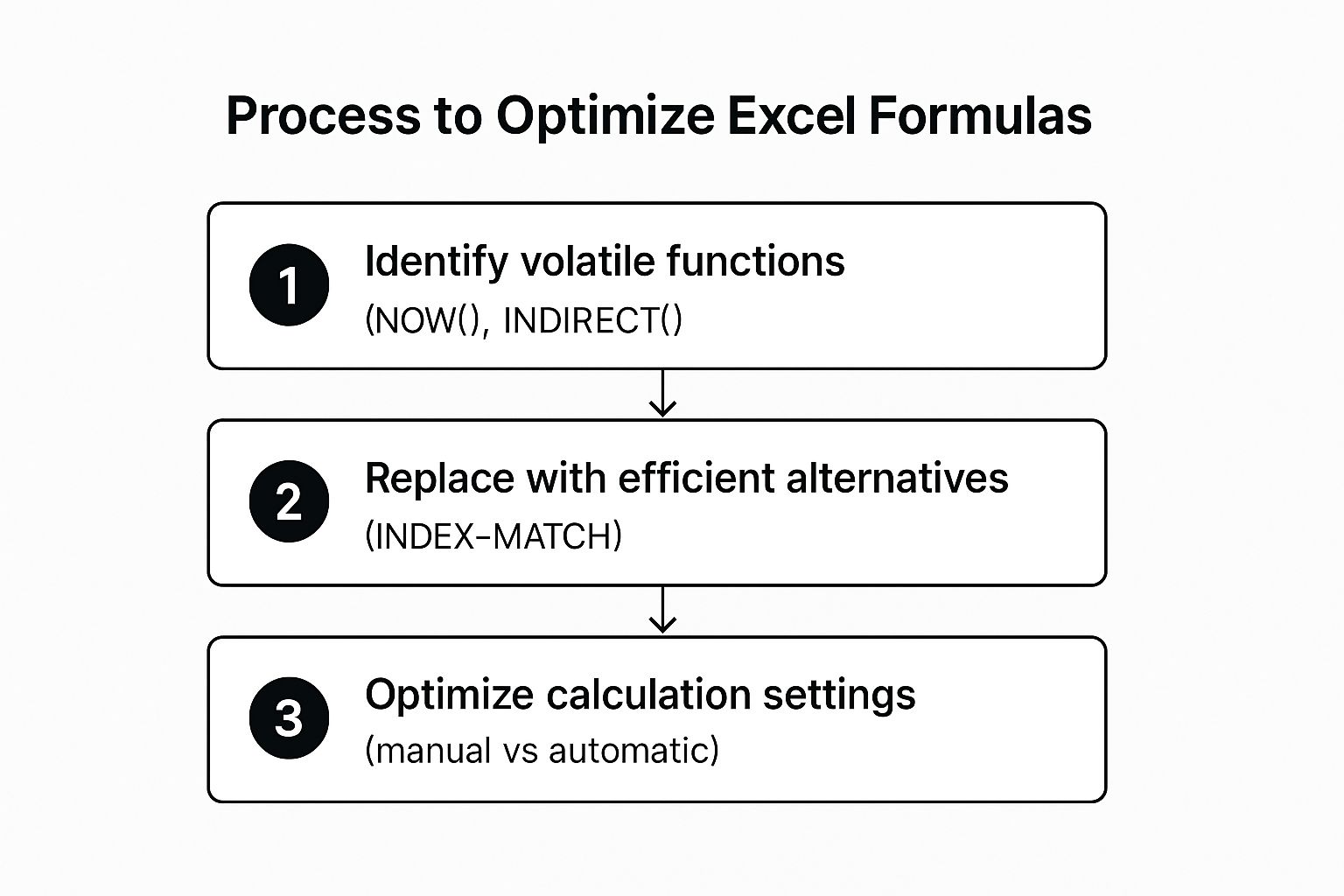
Following this sequence ensures you address the most common performance bottlenecks first, leading to more immediate and impactful improvements in your spreadsheet's speed.
Why It's a Game-Changer
Performance optimization is critical for anyone working with large-scale models. Financial analysts building complex valuation models and inventory managers tracking millions of SKUs cannot afford delays. A well-optimized spreadsheet provides instant results, allowing for rapid scenario analysis and timely decision-making. This is one of the most practical Excel data analysis tips for maintaining productivity.
Actionable Tips for Mastering Performance:
-
Replace Volatile Functions: Functions like
INDIRECT,OFFSET,TODAY, andNOWrecalculate every time any cell in the workbook changes. Replace them with more stable alternatives likeINDEXandMATCHor helper columns where possible. -
Avoid Entire Column References: Referencing an entire column (e.g.,
A:A) in a formula forces Excel to check over a million cells. Instead, use structured references with Excel Tables or specify a limited, dynamic range. - Switch to Manual Calculation: For extremely large files, navigate to Formulas > Calculation Options > Manual. This stops Excel from recalculating with every change, allowing you to control when updates happen by pressing the F9 key.
- Convert Formulas to Values: Once calculations are complete for historical data that won't change, copy the cells and paste them as values. This removes the processing load from those cells permanently.
8. Master Data Cleaning and Preparation Techniques
It's an often-cited statistic in data science: analysts spend up to 80% of their time cleaning and preparing data. This foundational step involves identifying and correcting errors, inconsistencies, and formatting issues within a dataset. Mastering data cleaning in Excel is a non-negotiable skill, as the quality of your analysis is directly dependent on the quality of your source data. This is one of the most crucial Excel data analysis tips because it prevents the classic "garbage in, garbage out" scenario.
Effective data preparation ensures that your numbers are accurate, your text fields are consistent, and your dates are correctly formatted. For instance, without proper cleaning, a CRM export might have multiple entries for the same customer due to spelling variations, or survey data might contain mixed response formats that make aggregation impossible. Excel offers a powerful suite of tools to tackle these very issues, transforming messy, raw data into a pristine dataset ready for analysis.
Why It's a Game-Changer
Properly cleaned data is the bedrock of reliable business intelligence. When you scrub your data, you build trust in your findings. Financial analysts rely on it to ensure consistent currency and date formats for accurate reporting, while marketing teams clean customer contact information to run effective campaigns. The process eliminates duplicates, standardizes entries, and corrects errors, ensuring your subsequent analysis with PivotTables or formulas is accurate and meaningful.
Actionable Tips for Mastering Data Cleaning:
- Work on a Copy: Never perform cleaning operations on your original raw data. Always create a backup or a working copy to prevent irreversible mistakes.
-
Use Flash Fill and TRIM: Leverage Flash Fill (Data tab) to automatically detect patterns and extract or combine data without formulas. Use the
=TRIM()function to remove leading, trailing, and extra spaces between words, a common issue with data exports. - Find and Correct Inconsistencies: Use the Find and Replace tool (Ctrl+H) to standardize terms (e.g., replacing "USA," "U.S.A.," and "United States" with a single consistent value).
- Document Your Steps: Keep a log of the cleaning steps you've performed. This documentation is vital for reproducibility and for explaining your methodology to stakeholders.
By dedicating time to this preparatory phase, you ensure the integrity of your entire analytical workflow. To build a robust data hygiene process, you can explore various data scrubbing techniques to master pristine data.
Excel Data Analysis Tips: Feature Comparison
| Item Title | Implementation Complexity 🔄 | Resource Requirements ⚡ | Expected Outcomes 📊 | Ideal Use Cases 💡 | Key Advantages ⭐ |
|---|---|---|---|---|---|
| Master PivotTables for Dynamic Data Summarization | Moderate; drag-and-drop interface, some learning curve | Moderate; Excel native, handles millions of rows | Dynamic, interactive summaries and reports | Business intelligence, sales, marketing, finance | Powerful data summarization, no formulas needed |
| Leverage Advanced Excel Functions for Complex Calculations | High; requires syntax knowledge and debugging skills | Low to moderate; formula-based, can slow with overuse | Precise conditional calculations and lookups | Financial modeling, inventory, detailed data matching | Highly flexible and powerful function combinations |
| Implement Data Validation and Conditional Formatting | Low to moderate; rule setup and management | Low; built-in Excel features | Improved data quality, instant visual feedback | Data entry control, dashboards, quality control | Prevents errors, enhances data consistency |
| Utilize Power Query for Data Transformation and Connection | Moderate to high; learning query editor and M language | Moderate to high; data processing and memory use | Automated data cleaning and complex transformations | Data consolidation, ETL, multi-source integration | Automates data prep, no coding needed for basics |
| Create Interactive Dashboards with Slicers and Charts | Moderate; requires design and setup skills | Moderate; multiple interactive elements consume resources | Engaging, real-time filtering and data exploration | Executive reporting, KPI monitoring, presentations | User-friendly interactivity, professional reports |
| Apply Statistical Analysis Tools and Functions | Moderate; enable ToolPak and understand stats methods | Low; built-in tools, some add-in setup | Comprehensive statistical insights | Market research, quality control, academic research | No extra software, broad business stats coverage |
| Optimize Performance with Efficient Formulas and Techniques | High; deep understanding of Excel calculation engine | Low to moderate; formula adjustments and settings | Faster, more reliable workbook performance | Large datasets, complex financial and scientific models | Dramatic speed improvements, crash prevention |
| Master Data Cleaning and Preparation Techniques | Moderate; multiple tools and steps | Low to moderate; depends on dataset size | Clean, reliable, analysis-ready datasets | CRM, surveys, financial data, inventory systems | Foundation for accurate analysis, error prevention |
Your Next Step in Excel Mastery
We've journeyed through eight foundational pillars of Excel data analysis, moving far beyond basic sums and simple tables. Each of the excel data analysis tips discussed in this guide represents a significant leap in analytical capability. You now have a roadmap for transforming raw, messy information into clear, actionable intelligence.
The true power of these techniques, however, is not just in knowing them, but in how they connect. Imagine a workflow where you start by using Power Query to automatically pull, clean, and shape data from multiple sources. You then feed this pristine dataset into a PivotTable, summarizing millions of rows in seconds. From there, you layer on advanced functions like XLOOKUP or SUMIFS to perform nuanced calculations that a standard PivotTable can't handle. Finally, you visualize your findings in an interactive dashboard, complete with slicers and dynamic charts, allowing stakeholders to explore the data for themselves. This integrated approach is where true mastery lies.
From Knowledge to Application
Reading about these tools is the first step, but genuine expertise is forged through practice. The transition from a passive learner to a proficient analyst happens when you intentionally apply these concepts to your own work. Don't wait for the perfect project. Instead, challenge yourself to incorporate one new technique this week.
Here’s a practical action plan to get you started:
- Revisit a Past Project: Take an old analysis you completed and see if you can rebuild it more efficiently using Power Query for data prep or a PivotTable instead of manual formulas.
- Automate a Repetitive Task: Identify a report you create regularly. Can you use data validation to prevent errors or Power Query to automate the data import and cleaning process? This will save you hours in the long run.
- Build a Mini-Dashboard: Grab a simple dataset, even personal budget data, and create a small dashboard with a few charts and a slicer. This hands-on practice builds muscle memory and confidence.
The goal is to make these advanced techniques your new default. When you see messy data, your first thought should be Power Query. When you need to summarize information, you should instinctively turn to PivotTables. This fluency is what separates a casual Excel user from a true data professional. By consistently applying these excel data analysis tips, you’re not just crunching numbers; you're building a robust, scalable analytical engine that drives smarter business decisions and elevates your professional value. Keep experimenting, stay curious, and you will unlock new levels of insight and efficiency.
Ready to wear your spreadsheet passion on your sleeve? Explore the unique collection of Excel-themed apparel and gear at SumproductAddict. From clever formula-based designs to stylish accessories for your office, it’s the perfect way to celebrate the tools you master every day. Find your new favorite Excel gear at SumproductAddict.