A Guide to Variance Analysis in Excel
Share
At its heart, variance analysis is pretty simple. You're just comparing what you planned to happen with what actually happened. The magic is in that one straightforward formula: Actual - Budget.
This little calculation tells you if you’re over or under your targets, but its real power is in helping you make much smarter business decisions. It’s the first step in turning a static spreadsheet into a story about your company's performance.
Why Bother with Variance Analysis in Excel?
Let's be honest, just subtracting two numbers isn't exactly rocket science. But when you do it systematically in Excel, variance analysis becomes a critical tool. It’s how you move from guesswork to genuine, data-driven insights. It’s how you start asking "why" a number is what it is.
Think of it as a financial health checkup for your business. It helps you find exactly where things are going right and, more importantly, where they’re going wrong.
Uncovering What's Really Happening in Operations
Good variance analysis shines a light on operational issues and growth opportunities you might otherwise miss.
For example, a sudden spike in manufacturing costs (a negative variance) could be your first clue about rising material prices or a bottleneck on the production line. On the flip side, a big positive variance in sales might point to a knockout marketing campaign or a new market trend you should be doubling down on.
These insights are gold for almost every team:
- Sales Teams: Can see which products or regions are blowing past their targets.
- Project Managers: Can keep a close eye on project spending to avoid those dreaded budget overruns.
- Finance Departments: Get a clearer picture of the company's overall health to make more accurate forecasts.
A well-designed dashboard can make these insights pop. You can instantly see where the biggest problems are, like a major unfavorable variance in operating expenses.
This kind of visual makes it impossible to ignore the areas that need immediate attention.
Before we dive deeper into the "how-to," it's helpful to understand the different types of variances you'll encounter and what they typically signal.
Key Variance Types and Their Business Implications
This table breaks down some of the most common variances and offers a quick look at what they might mean for your business performance.
| Variance Type | What It Compares | What a Negative (Unfavorable) Variance Might Mean |
|---|---|---|
| Sales Volume Variance | Actual units sold vs. Budgeted units sold | Lower-than-expected customer demand or ineffective sales strategies. |
| Sales Price Variance | Actual selling price vs. Budgeted selling price | Increased discounts, competitive pressure, or a shift in product mix. |
| Material Cost Variance | Actual cost of materials vs. Budgeted cost | Higher raw material prices, supply chain issues, or increased waste. |
| Labor Rate Variance | Actual labor wage rate vs. Budgeted rate | Unexpected overtime, use of higher-paid staff, or union rate changes. |
| Overhead Variance | Actual overhead costs vs. Budgeted overhead costs | Increased utility costs, unexpected maintenance, or higher rent. |
Understanding these distinctions is the first step toward diagnosing the root cause of a financial surprise, whether it's a pleasant one or not.
Driving Cost Control and Profitability
If you're serious about financial control, tracking variances isn't optional—it's essential. This is especially true in industries like manufacturing, where tiny deviations can snowball into massive hits to your bottom line.
In fact, some North American manufacturing firms have seen variance reports lead to cost control measures that slash overhead by up to 15% annually, all by catching unfavorable trends early. You can learn more about how to build a detailed variance analysis report in Excel on solving-finance.com.
The true power of variance analysis lies not in finding the difference, but in understanding the story behind it. It's the starting point for strategic conversations that drive improvement and profitability.
Getting a handle on this skill in Excel gives you an immediate and tangible way to add value. You're not just crunching numbers; you're equipping your organization for smarter management and continuous growth.
Setting Up Your Data for Accurate Analysis

Before you can even think about calculating a single variance, you have to get your data in order. I've seen it a hundred times: a messy, disorganized spreadsheet is the fastest path to frustrating errors and numbers you just can't trust.
The secret is to keep things clean and logical from the very start. Think of it as setting up your workspace before a big project—a little organization upfront saves you from major headaches later. For variance analysis, that means building a simple, tabular format.
Building Your Data Table
Pop open a blank sheet and start by creating distinct columns for each piece of your data. For a standard budget vs. actuals report, the layout is pretty intuitive.
Here’s a structure I always come back to because it just plain works:
- Column A: Category (e.g., "Office Supplies," "Software Subscriptions," "Travel Expenses")
- Column B: Budgeted Amount (Your planned figures for each category)
- Column C: Actual Amount (The real-world numbers you're measuring)
-
Column D: Variance (This is where the calculation will go—usually
Actual - Budget) - Column E: Variance % (And here's where you'll put the percentage variance formula)
This clean, side-by-side layout is easy for anyone to read. More importantly, it ensures your formulas can be dragged down across hundreds of rows without breaking. If your source data is a bit of a mess, it's worth taking a detour to check out some tips for how to clean data in Excel before you go any further.
Pro Tip: Whatever you do, never merge cells within your main data table. Merged cells are the nemesis of formulas, filters, and PivotTables. If you want to center a header over multiple columns, use the "Center Across Selection" formatting option instead. It's a lifesaver.
The Power of Named Ranges
Once your table is set up, you can make your formulas much more intuitive by using Named Ranges. Instead of a cryptic formula like =C2-B2, imagine writing one that reads =Actuals-Budget. It’s a game-changer, especially in bigger or more complex workbooks.
Here’s how to create one:
- Highlight the data in a specific column (for instance, all the numbers under "Actual Amount").
- Click into the Name Box, which is that little box to the left of the formula bar.
- Type a simple, one-word name (like "Actuals" or "Budget_Data") and hit Enter.
Now you can use those names directly in your formulas. This one simple habit makes your spreadsheets incredibly easy to read and troubleshoot—not just for you, but for any colleague who opens it. It’s a professional touch that immediately signals a well-built file.
Essential Formulas for Calculating Variance
Alright, with your data laid out neatly, it's time for the fun part: making it talk with formulas. The great news is that the heart of variance analysis in Excel is just simple arithmetic. From there, you can layer on more complexity for some seriously powerful insights.

The first and most basic calculation you'll do is for absolute variance. It’s nothing more than a straightforward subtraction to see the raw difference between what you planned for and what actually happened.
=C2 - B2
Assuming your 'Actuals' are in column C and your 'Budget' is in column B, this formula instantly shows if you're over or under budget in pure dollar terms.
But here's the thing: a $5,000 variance on a $10,000 budget is a huge deal. That same $5,000 variance on a $1,000,000 budget? Barely a blip on the radar. This is exactly why we need to look at percentage variance.
Adding Context with Percentage Variance
To really get a feel for the impact of a variance, you have to calculate it as a percentage of your budget. This simple step adds crucial context and helps you immediately spot which deviations demand your attention.
The formula for percentage variance looks like this:
=(C2 - B2) / B2
This calculation effectively normalizes the variance, giving you an apples-to-apples comparison across all your categories, no matter their size. Just remember to format the cell as a percentage to make it easy to read at a glance.
Handling Errors and Zeros Gracefully
One of the most common frustrations I see is the dreaded #DIV/0! error. It pops up in your percentage variance calculation anytime a budget value is zero or even just blank. A report filled with these errors not only looks sloppy but can also break other formulas that depend on that column.
The fix is simple: wrap your formula in the IFERROR function. It’s a lifesaver. This function checks if your formula spits out an error and, if it does, lets you show a different value instead.
For example: =IFERROR((C2-B2)/B2, 0)
This formula tells Excel, "Try to calculate the percentage variance. If you can't because you're trying to divide by zero, just show a 0 instead." It keeps your report clean, professional, and functional. To get comfortable with this and other must-know formulas, have a look at our Excel formula cheat sheet.
A clean, error-free report is a trustworthy report. Using logical functions like IFERROR is a small step that makes a huge difference in the professional quality of your analysis. It shows you've anticipated potential problems and built a robust spreadsheet.
Digging Deeper with Statistical Variance
For those who want to take their analysis to a more statistical level, Excel has functions to measure the dispersion, or "spread," within a dataset. The two you’ll encounter most are VAR.P and VAR.S.
- VAR.P (Population Variance): You'll use this when your data represents the entire group you're analyzing. Say you're looking at final sales figures for all four of your company's regional offices. That's the whole population, so you'd use VAR.P.
- VAR.S (Sample Variance): This is for when your dataset is just a sample of a larger group. If you're only analyzing sales from one of those four offices to estimate how the whole company is doing, that's a sample. Use VAR.S.
These statistical functions have become indispensable for analysts who need to understand data consistency with precision. For example, a researcher could use VAR.P to see how much individual exam scores deviate from the class average, giving a clear picture of performance consistency. For a deeper dive, Microsoft's support page on its powerful Analysis ToolPak is a great resource.
Visualizing Data with Charts and Formatting

Let's be honest. The calculations and formulas are the engine of your variance analysis in Excel, but nobody gets excited about a wall of numbers. If you want your findings to actually make an impact, you have to make them visual. This is how you stop presenting dense spreadsheets and start telling a compelling story that even your non-finance colleagues can grasp instantly.
The fastest way to do this? Conditional Formatting. This is an absolute game-changer. It’s a built-in Excel feature that automatically changes how a cell looks based on what’s inside it. For variance analysis, it’s perfect for making the important stuff jump right off the page.
Making Variances Pop with Conditional Formatting
Think about that column of variance data you just calculated. Some numbers are positive (good news!), and others are negative (not so good). Instead of forcing people to squint and find the minus signs, you can use color to do the heavy lifting.
A classic, effective approach is a simple color scale:
- Highlight cells with a value greater than 0 in green. This is an instant signal for a favorable variance, like coming in under budget.
- Highlight cells with a value less than 0 in red. This immediately flags trouble spots, like a major budget overrun.
This simple red-and-green trick transforms a boring list of figures into a high-level dashboard. A manager can glance at it and know exactly where the problems are without reading a single number. You can even take it a step further with icon sets (think up/down arrows) or data bars to show the magnitude of the variance right inside the cell.
Your goal isn't just to present data; it's to guide the viewer's eye to what matters most. Effective visualization reduces cognitive load and accelerates decision-making. People should grasp the key takeaways in seconds, not minutes.
Creating Dynamic Variance Charts
Once you've made your key numbers stand out, it's time to build charts that tell the full story. A standard bar chart comparing 'Actual' vs. 'Budget' is fine, but for variance analysis, Excel has much more powerful tools in its arsenal.
My personal favorite is the waterfall chart. It's brilliant for showing the cumulative effect of a series of positive and negative changes. For example, you can start with your budgeted profit, then show how each variance—like higher sales, but also higher material costs—chipped away or added to it, leading to the final actual profit. It masterfully shows the journey from plan to reality.
Another great choice is a combination chart. With this, you can plot your budget and actual figures as columns while showing the percentage variance as a line on a second axis. This packs a ton of context into one visual, showing not just the raw numbers but the relative severity of the misses.
The key to great visuals is always clarity and purpose. If you want to really get this right, you can master data visualization best practices for impactful insights in our deep-dive guide. These techniques will make sure all your hard analytical work gets the attention it deserves.
Automating Reports with Pivot Tables
While manual formulas are great for a quick look at a small dataset, they become a real headache when you're dealing with lots of information. I’ve seen it countless times—people spend hours updating ranges, dragging formulas down, and chasing down errors. It’s not just slow; it’s a recipe for disaster.
This is exactly where Pivot Tables come in. They completely change the game, turning your static, fragile analysis into a dynamic, automated reporting machine.
Instead of wrestling with formulas for every single row, a Pivot Table can summarize massive amounts of data in just a few clicks. It does all the heavy lifting for you. The real trick is getting your source data set up in a "pivot-friendly" way. It’s a little different from the side-by-side layout we used for manual formulas, but it’s far more powerful.
Structuring Data for Pivot Tables
To get your data ready for a Pivot Table, you need to think like a database. Forget wide tables with budget and actuals next to each other. Instead, you want a simple, long list where each row represents a single piece of information.
A solid structure for variance analysis usually includes these columns:
- Category: The expense or revenue type (e.g., "Software," "Marketing," "Travel").
- Period: The month, quarter, or year the data belongs to.
- Type: A label that clearly marks the number as "Budget" or "Actual."
- Amount: The dollar (or other currency) value itself.
This "long" format is incredibly scalable. When next month’s data comes in, you just paste the new rows at the bottom. No re-engineering your sheet.
Once your data is organized this way, just click any cell inside your data range and navigate to Insert > PivotTable. Excel will pop open a new sheet with the PivotTable Fields pane, ready for action. Drag "Category" to the Rows area, "Type" to the Columns area, and "Amount" to the Values area. Just like that, you have a clean summary of Budget vs. Actual for every single category.
If you want to see this in action with more scenarios, checking out some different Excel Pivot Table examples can unlock new data insights and really get the ideas flowing.
Using Calculated Fields for Automatic Variances
Now for the real magic: letting the Pivot Table do the math for you. Instead of cluttering your source data with extra formula columns, you can create virtual columns right inside the pivot itself. These are called Calculated Fields.
This is a game-changer because it keeps your source data clean and ensures your variance calculations update automatically whenever you refresh your data.
Here’s how to create a calculated field for your absolute variance:
- Click anywhere inside your new Pivot Table.
- Head over to the PivotTable Analyze tab on the ribbon.
- Click on Fields, Items, & Sets, and then select Calculated Field.
- In the Name box, give it a clear name, something like "Variance_Amount".
- In the Formula box, build the formula by double-clicking your fields from the list. It should end up looking like this:
= 'Actual' - 'Budget'. (Excel adds the single quotes for you).
Click OK, and bam—your new "Variance_Amount" field appears in the Pivot Table, fully calculated.
The biggest win with Calculated Fields is that they are totally independent of your report's layout. You can pivot your data around, add or remove fields, and the variance math stays correct without you ever having to touch a formula.
You can do the exact same thing to create a percentage variance. Just create another calculated field with a formula like = ('Actual' - 'Budget') / 'Budget'.
Now you've built a fully interactive report. From here, you can add Slicers to filter by month or use the drill-down features to explore your data, all without writing another manual formula again.
Common Questions About Variance Analysis
Even with all the right formulas and charts at your fingertips, you're bound to hit a few tricky spots when you get into the weeds of variance analysis in Excel. As you move from simple homework problems to real-world reporting, certain questions always seem to pop up. Let's walk through some of the most common ones I hear.
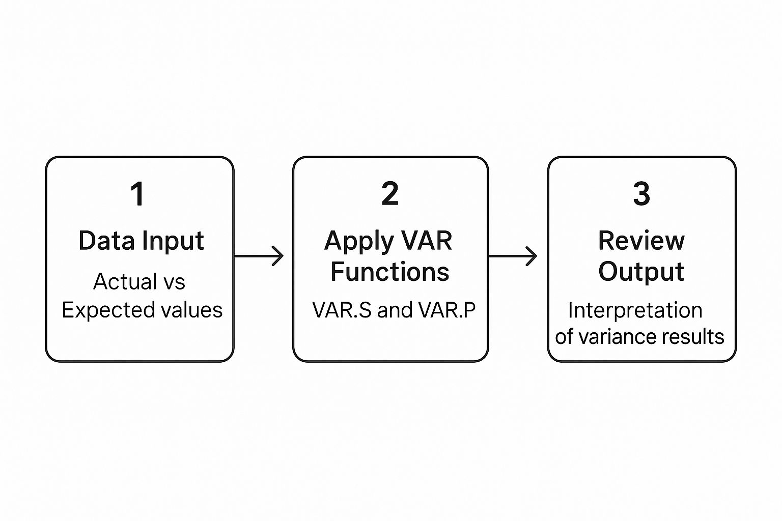
Think of it as a simple workflow: good data in, smart formulas, and then the most important part—actually interpreting what the numbers are telling you.

This process really hinges on that first step. If your data is a mess, the rest of the analysis will be, too. Clean inputs lead to applying the right functions (like VAR.S or VAR.P), which finally gives you results worth reviewing.
How Do I Handle Negative Numbers in Percentage Variance Calculations?
This is a classic headache. Calculating percentage variance when you've got negative numbers in the mix can get ugly fast. The standard (Actual - Budget) / Budget formula can spit out results that are technically correct but practically misleading.
For example, say you budgeted a cost of -$100, but the actual cost came in at -$120. The formula gives you a 20% variance, which at first glance looks like a good thing. But it’s not—it's a cost overrun!
A much better approach is to use the absolute value of the budget in your denominator: (Actual - Budget) / ABS(Budget). This formula correctly shows the magnitude of the variance without the confusing sign flip. My go-to best practice? Always analyze revenue and expense variances separately. Then, use Conditional Formatting or simple text labels to clearly mark each line as 'Favorable' or 'Unfavorable' based on what it actually means for the business.
What Is the Best Way to Create a Rolling Variance Report?
If you want a rolling variance report that you can update without pulling your hair out, the secret is structuring your data in a "long" format. Stop putting each month in its own column!
Instead, build a single, clean table with these headers:
- Date
- Category
- Type (e.g., Budget/Actual)
- Amount
This layout is a Pivot Table's best friend. From there, you can drag 'Date' into the Columns field (and group it by month), 'Category' into Rows, and 'Amount' into Values (one for Budget, one for Actual). The magic happens when you add a Calculated Field for the variance.
The finishing touch is to add a Slicer for the 'Date' field. Now you can dynamically filter your report for any rolling period you need—the last 3, 6, or 12 months—with a single click.
The real power of a rolling report is how it adapts. By using a Pivot Table with a proper data structure, you move from a static, month-end chore to a dynamic, continuous analysis tool.
Can I Combine Variance Analysis with Forecasting in Excel?
Absolutely. In fact, this is how you graduate from reactive reporting to proactive management. It’s a game-changer.
The easiest way to pull this off is by creating a 'Budget vs. Actual vs. Forecast' report. All you have to do is add a 'Forecast' column right alongside your Budget and Actual data.
Your analysis suddenly gets two powerful new calculations:
-
Forecast vs. Actual Variance:
Actual - Forecast -
Budget vs. Forecast Variance:
Forecast - Budget
The first variance tells you how good your forecasting model is. Are your predictions hitting the mark? The second one shows if your current game plan (the forecast) is already drifting away from your original strategy (the budget).
Combining these gives you a powerful early-warning system. You can spot trouble and adjust your strategy mid-period, using both your original plan and your updated predictions to guide you.
Ready to show off your data skills in style? Check out the hilarious and clever Excel-themed merch at SumproductAddict. From SUMIF sweatshirts to VLOOKUP desk mats, we have the perfect gear for spreadsheet enthusiasts. https://sumproductaddict.com