7 Data Visualization Examples to Inspire You in 2025
From Raw Numbers to Revelations: The Power of Visual Data
In a world saturated with data, the ability to transform raw numbers into clear, compelling narratives is no longer a niche skill; it is a fundamental business necessity. Effective data visualization bridges the gap between complex datasets and actionable insights, enabling faster, more informed decision-making. This article moves beyond theoretical discussions to provide a deep, strategic analysis of real-world data visualization examples that have successfully turned data into revelations. We will dissect what makes these visualizations work, not just aesthetically, but functionally.
This is not a gallery of pretty charts. Instead, it is a curated collection designed for practical application. We will break down iconic and innovative examples, from interactive dashboards like Spotify Wrapped to historical game-changers like John Snow's cholera map. For each example, you will find a detailed strategic analysis, specific tactical insights, and actionable takeaways you can apply to your own projects. Our focus is on replicable strategies and methods, giving you a framework for building more effective visualizations.
This comprehensive guide is built to help you master the craft of visual data communication. You will learn how to:
- Choose the right chart type for your specific dataset and objective.
- Implement design best practices that enhance clarity and impact.
- Structure data stories that guide your audience to a specific conclusion.
- Incorporate interactivity to empower user-driven exploration and discovery.
By exploring these powerful data visualization examples, you will gain the strategic understanding needed to elevate your own work from simple reporting to influential storytelling. Let’s dive into the examples that demonstrate how to translate data into decisive action.
1. Interactive Dashboard - Spotify Wrapped
Spotify Wrapped has transcended being a mere feature; it's a cultural event that brilliantly showcases the power of personalized, narrative-driven data visualization. Each year, it transforms a user's raw listening data into an engaging, animated, and highly shareable story. This approach has set a new standard for how companies can present user data back to their audience, making it feel less like a dry report and more like a personalized gift. It masterfully combines various chart types, from simple bar graphs of top genres to more abstract visualizations representing a user's "listening personality."
The success of Spotify Wrapped provides a masterclass in turning data into a viral marketing engine. This interactive dashboard is a prime example of data visualization that doesn't just inform, but entertains and fosters a sense of community. Other platforms like Apple Music's Replay and Strava's Year in Sport have adopted similar models, demonstrating the effectiveness of this strategy across different industries. The core principle is transforming personal metrics into a compelling narrative that users are eager to explore and share.
Strategic Analysis and Tactical Breakdown
Spotify's strategy hinges on several key elements:
- Narrative Storytelling: Instead of presenting a static dashboard with key performance indicators (KPIs), Wrapped guides users through a multi-screen story. It builds anticipation, reveals surprising insights ("You were in the top 1% of Taylor Swift listeners"), and culminates in a shareable summary. This turns data consumption into an experience.
- Progressive Disclosure: The information is delivered in bite-sized, animated chunks. This prevents cognitive overload and keeps the user engaged, swiping to see the next piece of their personal data story.
- Designing for Virality: Every screen is optimized for social media. The aspect ratio fits phone screens perfectly, the visuals are bold and colorful, and the final summary cards are designed to be easily posted on Instagram Stories or X (formerly Twitter).
The fundamental process behind creating a campaign like Spotify Wrapped involves collecting user data, processing it through an analytics engine, and then generating personalized visual outputs. This workflow turns raw data points into a powerful marketing asset.
The following infographic illustrates the core, simplified process of turning user data into a shareable social campaign.
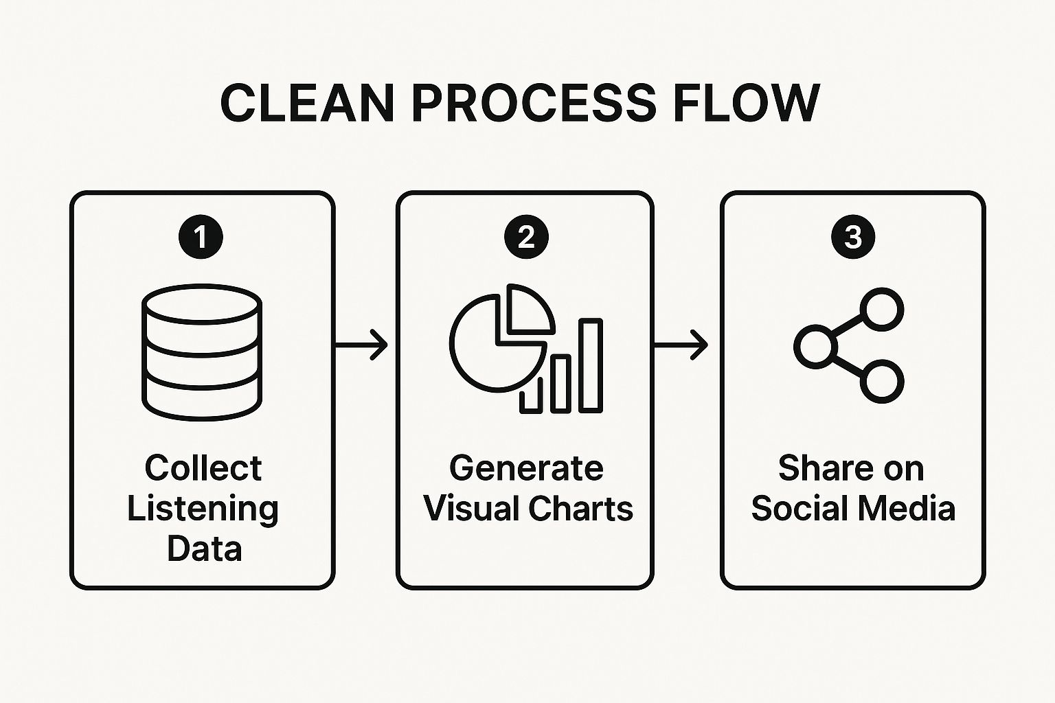
This visualization demonstrates how a linear process transforms passive data collection into active user engagement and brand promotion.
Actionable Takeaways for Your Projects
To replicate this success, focus on turning user data into a personalized story. Start by identifying unique data points that would surprise or delight your audience. Ensure the entire experience is mobile-first and inherently shareable. By following these data visualization examples, you can create more than just charts; you can create memorable experiences. For more guidance on creating compelling visuals, you can explore some master data visualization best practices for impactful insights.
2. Real-time Data Visualization - COVID-19 Dashboard by Johns Hopkins
The Johns Hopkins University COVID-19 Dashboard became a global benchmark for real-time data visualization during a crisis. It aggregated and displayed complex, rapidly changing pandemic data in an accessible and authoritative manner. By providing a centralized, trusted source of information, it showcased how effective visualization can empower public health officials, journalists, and the general public to understand the scale and spread of a global event. The dashboard masterfully integrated interactive maps, time-series line charts, and summary tables to present a multi-faceted view of the pandemic.
This dashboard is a landmark example of data visualization used for critical public service, moving beyond business intelligence to inform global decision-making. Its success in synthesizing data from hundreds of sources into a coherent, real-time picture demonstrated the immense value of clarity and transparency in crisis communication. Similar platforms like Worldometer and Google's Community Mobility Reports emerged, but the Johns Hopkins dashboard set the standard for credibility and comprehensive design. Its core principle was to democratize access to vital public health data through clear, interactive visualization.
Strategic Analysis and Tactical Breakdown
The dashboard's unparalleled impact was built on several strategic pillars:
- Establishing a Single Source of Truth: In a climate of misinformation, the dashboard's primary strategic goal was to be the definitive, non-partisan source for pandemic data. This was achieved by meticulously documenting data sources and being transparent about their methodology, which built immense trust.
- Layered Information Density: The design allowed users to see the global overview at a glance via the world map, then drill down into specific countries or regions for more granular data. This caters to different user needs, from a casual observer to a public health researcher.
- Designing for Performance and Accessibility: Anticipating massive global traffic, the platform was engineered for high availability and quick loading times. The interface was intentionally straightforward, ensuring that users with varying levels of data literacy could interpret the charts and numbers effectively.
The fundamental process involved creating a robust data pipeline that could automatically pull, clean, and standardize information from diverse global sources. This required significant data engineering to manage inconsistencies and ensure near real-time updates. This workflow transformed chaotic, raw data streams into a structured and trustworthy public utility.
Actionable Takeaways for Your Projects
To emulate this dashboard's effectiveness, prioritize data integrity and user-centric design. Clearly cite your data sources and explain your methodology to build credibility with your audience. Design your visualizations to allow for both a high-level overview and a detailed drill-down. For projects involving complex data aggregation from multiple sources, mastering data transformation is key; you can explore a powerful Excel Power Query tutorial to master data transformation now. These data visualization examples highlight that in high-stakes scenarios, clarity and trust are the most important metrics.
3. Interactive Network Visualization - Facebook Social Graph
Facebook’s social graph is a foundational example of how data visualization can untangle immense complexity, transforming abstract connections into intuitive visual maps. This interactive network visualization represents users (nodes) and their relationships (edges) to reveal the intricate web of social interactions. It moved beyond simple friend lists to show mutual friends, shared interests, and community structures, making the invisible fabric of social networks visible and explorable. This approach has become a cornerstone for analyzing any system defined by relationships, from supply chains to biological networks.

The power of the social graph visualization lies in its ability to surface patterns that are impossible to see in tabular data. Tools like LinkedIn's network visualizer and dedicated platforms like Gephi have adopted these principles, allowing analysts to identify key influencers, uncover clusters of activity, and understand how information flows. It's a prime example of data visualization used for discovery, where the visual itself becomes the primary tool for analysis. The core principle is mapping relationships to identify structure and influence within a complex system.
Strategic Analysis and Tactical Breakdown
Facebook’s strategy was built on making its vast dataset understandable and engaging, both internally for analysis and externally as a user-facing feature.
- Force-Directed Layouts: This is the key algorithm that makes these graphs intuitive. It treats the network like a physical system where connected nodes are pulled together and unconnected nodes are pushed apart. The result is an organic layout where densely connected communities naturally cluster together, revealing the network's underlying structure without manual intervention.
- Interactivity for Exploration: A static graph of millions of users would be useless. The real power comes from interactivity. Users and analysts can pan, zoom, click on nodes to see detailed information (via tooltips), and filter the network to isolate specific communities or connection types. This transforms the visualization from a static picture into a dynamic analytical tool.
- Scalability Techniques: Visualizing millions or billions of connections is a massive technical challenge. Strategies like edge bundling (grouping parallel edges into thicker lines) and node clustering (collapsing tight-knit communities into a single super-node) are used to reduce visual clutter and make large-scale networks comprehensible.
The fundamental process involves defining entities as nodes and their relationships as edges, then applying a physics-based layout engine to arrange them. Further layers of data, like user activity or influence scores, can be encoded using color, size, or thickness, adding more dimensions to the analysis.
Actionable Takeaways for Your Projects
To leverage network visualization, start by identifying the core entities and relationships in your dataset. Focus on making the graph interactive, allowing users to drill down and filter the view to find their own insights. Even if you're working with more traditional datasets, the principles of interactivity can be applied. To create similarly engaging visual tools, check out this Excel dashboard tutorial to build stunning interactive reports. By implementing these data visualization examples, you can turn complex relational data into a clear and powerful analytical instrument.
4. Data Storytelling - The Pudding's Visual Essays
The Pudding has elevated data visualization from a simple reporting tool into an art form, creating long-form visual essays that blend deep journalistic inquiry with sophisticated interactive design. Their work is a prime example of data storytelling, where a narrative guides the audience through complex datasets to reveal profound insights about culture and society. Unlike a static dashboard, these visual essays use a combination of text, animated charts, and user interaction to build a compelling argument, piece by piece. They tackle diverse topics, from analyzing gender bias in film dialogue to mapping the evolution of music tastes.
What sets The Pudding apart is its commitment to the story first and the visualization second. The charts and graphs are not the endpoints; they are the narrative devices that carry the story forward. This approach has set a benchmark for how data can be used in journalism and content marketing to engage audiences on an intellectual and emotional level. Projects like The New York Times' '512 Paths to the White House' and ProPublica's 'Machine Bias' investigation follow a similar ethos, using data to uncover and explain complex societal issues, proving the power of this narrative-driven format.
Strategic Analysis and Tactical Breakdown
The Pudding's strategy is built on crafting a cohesive and persuasive narrative experience:
- Narrative Arc: Each project is structured like a traditional story with a clear beginning, middle, and end. It introduces a central question, presents evidence through a series of interconnected visualizations, and builds towards a powerful conclusion. This narrative structure keeps readers invested and helps them understand complex information.
- Scrollytelling: This is a core tactic where the user's scrolling action triggers animations and reveals new layers of data. As a user scrolls down the page, charts build, morph, and highlight key points in sync with the narrative text. This creates a cinematic, guided experience that controls the pacing of information and focuses the user's attention.
- Transparency and Authority: A key part of their strategy is to build trust. The Pudding often makes their datasets and code publicly available, allowing others to verify their findings and build upon their work. This commitment to transparency bolsters their credibility and positions them as an authority in data journalism.
The fundamental process involves intensive research and data collection, followed by a storyboarding phase where the narrative and visual flow are meticulously planned. Only then does the development of the interactive visualizations begin, ensuring every chart serves the story's purpose. This methodology turns raw data into a compelling, educational, and often viral piece of content.
Actionable Takeaways for Your Projects
To leverage this powerful form of data visualization, start by defining the story you want to tell before you create a single chart. Think about the core message or question you want your audience to understand. Use the scrollytelling technique to guide users through your data points, revealing insights sequentially to avoid overwhelming them. By prioritizing a strong narrative, you can transform a simple dataset into an unforgettable story. These data visualization examples show that when data is wrapped in a compelling narrative, its impact is magnified significantly.
5. Geographic Data Visualization - John Snow's Cholera Map
John Snow's 1854 map of a London cholera outbreak is one of history's most powerful data visualization examples, often cited as the origin of modern epidemiology. By plotting cholera deaths as small bars on a street map, Snow transformed abstract mortality statistics into a clear geographic pattern. This visualization revealed that cases were overwhelmingly clustered around a specific water source, the Broad Street pump, providing compelling evidence that the disease was waterborne, not airborne as was commonly believed. This single map not only identified the outbreak's source but also proved that spatial analysis could directly inform public health interventions and save lives.

The legacy of Snow's map is evident in modern geographic information systems (GIS) used today. From tracking the spread of COVID-19 with real-time dashboards to police departments analyzing crime hotspots and urban planners assessing resource allocation, the core principle remains the same. Placing data onto a map adds a crucial layer of context, revealing relationships, patterns, and outliers that are invisible in a simple table or spreadsheet. This method is fundamental for any analysis where "where" is as important as "what" or "when."
Strategic Analysis and Tactical Breakdown
Snow's genius was not just in collecting the data but in choosing the right way to display it. His strategy provides timeless lessons for modern data professionals:
- Spatial Correlation over Simple Counts: Instead of just listing the number of deaths, Snow mapped each individual case to its physical location. This allowed him to visually correlate deaths with proximity to potential sources, a tactic that instantly highlighted the Broad Street pump as the epicenter.
- Contextual Layering: The map included critical geographic context, such as street layouts, the location of all water pumps, and major landmarks like the local workhouse. This layering was essential; it allowed him to not only identify the cluster but also investigate anomalies, such as why workers at a nearby brewery were not getting sick (they had their own well).
- Data-Driven Hypothesis Testing: The map was a tool for testing a hypothesis. Snow believed cholera was waterborne, and the visualization provided the evidence needed to convince skeptical public officials. Removing the handle from the Broad Street pump, an action prompted by his map, led to a dramatic drop in new cases, validating his findings.
The fundamental process involves geocoding data points (assigning latitude and longitude coordinates to addresses or locations) and plotting them on a base map. Additional data layers, such as demographics, infrastructure, or environmental factors, can then be overlaid to uncover deeper insights. This technique turns raw location data into a powerful analytical tool.
Actionable Takeaways for Your Projects
To leverage geographic visualization, focus on adding spatial context to your datasets. Identify data points with location information, such as customer addresses, store locations, or incident reports. Use heatmaps to show density, choropleth maps to display data by region, or symbol maps to pinpoint specific events. By following these data visualization examples, you can uncover hidden geographic trends. For more on creating effective visual analytics, exploring resources on visual analytics best practices can provide a strong foundation.
6. Interactive Time Series - New York Times COVID-19 Case Curves
During a global crisis defined by uncertainty, the New York Times’ interactive COVID-19 case curves became a pillar of public understanding. These time series visualizations did more than just report numbers; they provided crucial context that helped millions grasp the abstract concept of "flattening the curve." By plotting new cases over time for different countries and states, the charts made the threat of exponential growth tangible and the impact of public health interventions visible. This work set a benchmark for data journalism, demonstrating how to communicate complex, fast-changing data with clarity and authority.
The power of these visualizations came from their interactivity and thoughtful design. Users could hover over points in time to see specific figures, toggle between linear and logarithmic scales to understand different aspects of the growth rate, and compare trajectories across various regions. This level of user control transformed passive data consumption into an active exploration, empowering the public to make sense of the pandemic's scale. The approach was so effective that it was widely emulated by other leading outlets like the Financial Times and organizations such as Our World in Data, cementing the interactive time series as an essential tool in public health communication.
Strategic Analysis and Tactical Breakdown
The New York Times' strategy was rooted in making an overwhelming stream of data accessible and meaningful to a non-expert audience.
- Contextual Annotations: The charts were not just lines on a graph. The graphics team, including Josh Katz, Margot Sanger-Katz, and Kevin Quealy, added crucial annotations marking significant events like lockdowns, policy changes, or holidays. This provided vital context, helping users correlate real-world events with changes in data trends.
- Scale optionality: Providing both logarithmic and linear scales was a brilliant tactical decision. The linear scale showed the raw magnitude of case numbers, while the logarithmic scale revealed the rate of growth, making it easier to see if a curve was truly bending. This catered to both casual observers and more data-savvy readers.
- Methodological Transparency: In a time of rampant misinformation, the NYT team meticulously documented their data sources and methodology. This transparency built immense trust and established their charts as a definitive source of truth, a critical factor when presenting high-stakes information.
The core tactic was to present data not as a static snapshot but as an evolving story. By consistently updating the charts and adding new layers of analysis, they maintained audience engagement over months, a feat for any data visualization. These data visualization examples show how to maintain relevance and authority over a long-term event.
Actionable Takeaways for Your Projects
To implement this level of clarity in your own time series projects, focus on user guidance and context. Allow users to explore the data but guide their interpretation with annotations and clear explanations. Always be transparent about your data sources and any transformations you've applied. When dealing with large datasets over time, consider using tools that can summarize and pivot the information effectively. For those working with spreadsheet data, you can explore some Excel pivot table examples to unlock data insights, which can be a powerful first step in structuring time-based data for visualization.
7. Comparative Visualization - Gapminder's Bubble Chart
Hans Rosling’s work with the Gapminder Foundation fundamentally changed how the public perceives and interacts with global statistics. The Gapminder animated bubble chart is a seminal piece of data visualization that brings complex development data to life, showing relationships between multiple variables across countries and over time. It famously plots life expectancy against income per capita, with each bubble representing a country, its size indicating population, and its color denoting the continent. This dynamic visualization debunks long-held myths about a static "developing world" by clearly showing progress and divergence over decades.
The genius of this comparative visualization lies in its ability to tell a profound story with data. Instead of static tables or disconnected charts, Rosling created a moving, breathing representation of human history. This approach makes complex, multi-dimensional data accessible and emotionally resonant. Its influence is seen in tools like Google's Public Data Explorer and the World Bank's data visualization platforms, which have adopted similar interactive methods to engage users with vast datasets. These tools showcase how to transform dense statistical information into an intuitive visual journey.
Strategic Analysis and Tactical Breakdown
Gapminder's strategy is rooted in making data storytelling dramatic and understandable:
- Multi-Variable Storytelling: The bubble chart is a masterclass in encoding multiple data dimensions simultaneously without overwhelming the user. It uses the X-axis (income), Y-axis (health), bubble size (population), and color (region) to present a rich, layered narrative in a single, coherent view.
- Animation as a Narrative Device: The key innovation is the use of time as an animated dimension. Watching the bubbles move across the chart from one year to the next turns a static comparison into a compelling movie about global development. This allows viewers to observe trends, turning points, and historical events as they unfold.
- Debunking Misconceptions: Rosling used this visualization with a clear purpose: to challenge outdated worldviews. By showing the data, he could powerfully argue against the simplistic "us versus them" dichotomy, making his presentations legendary for their impact and clarity.
The core tactic is to layer information visually and then add a temporal dimension to reveal patterns that would otherwise be hidden. This makes it one of the most powerful data visualization examples for historical or longitudinal analysis.
Actionable Takeaways for Your Projects
To leverage this approach, think about how you can use animation to reveal change over time. Focus on encoding multiple variables using size, color, and position to create a richer context. Always provide user controls like pause, replay, and speed adjustments to allow for deeper exploration. For those working with simpler datasets, understanding the principles of effective comparison is still crucial. You can create highly effective comparative visuals even with more basic tools. For a foundational understanding, you can explore tutorials on how to master Excel charts and graphs for insightful comparisons.
7 Key Examples of Data Visualization Types
| Visualization Type | Implementation Complexity 🔄 | Resource Requirements ⚡ | Expected Outcomes 📊 | Ideal Use Cases 💡 | Key Advantages ⭐ |
|---|---|---|---|---|---|
| Interactive Dashboard - Spotify Wrapped | High - requires multidisciplinary team and annual updates | High - intensive design, animation, and data handling | High engagement, viral marketing, strong brand loyalty | Personalized annual summaries, marketing campaigns | Engaging storytelling, emotional data connection, social sharing boost |
| Real-time Data Visualization - COVID-19 Dashboard | High - real-time data integration and maintenance | High - server infrastructure and data validation | Trusted real-time information, policy influence | Crisis communication, public health monitoring | Authoritative data source, immediate awareness, researcher access |
| Interactive Network Visualization - Facebook Social Graph | Very High - complex algorithms and large-scale data processing | Very High - high computation and privacy safeguards | Insight into social connections, exploratory user engagement | Social media, relationship mapping, network analysis | Intuitive complex relationships, scalable, interactive exploration |
| Data Storytelling - The Pudding's Visual Essays | High - intensive narrative and visual design | Medium - requires multidisciplinary expertise | Educated and engaged audience, influential storytelling | Journalism, educational data narratives | Combines narrative with visualization, accessible, advances data journalism |
| Geographic Data Visualization - John Snow's Cholera Map | Low to Medium - simple design but requires careful data plotting | Low - manual plotting with limited tech | Critical public health insight, policy change | Epidemiology, crime and environmental mapping | Clear spatial analysis, simple yet impactful design |
| Interactive Time Series - NYT COVID-19 Case Curves | Medium - requires interactive charts and frequent updates | Medium - data processing with responsive design | Informed public understanding, policy influence | Pandemic tracking, trend analysis | Makes complex trends accessible, frequent updates, geographic comparison |
| Comparative Visualization - Gapminder's Bubble Chart | Medium to High - multi-dimensional data and animations | Medium - data quality and interactive playback | Engaged audience debunking misconceptions | Global development, multi-variable data exploration | Intuitive multi-dimensional view, memorable animations, challenges preconceptions |
Your Next Steps: From Inspiration to Implementation
We have journeyed through a diverse landscape of powerful data visualization examples, moving far beyond simple charts to explore the strategic impact of well-executed visual analytics. From the hyper-personalized storytelling of Spotify Wrapped to the life-saving clarity of the Johns Hopkins COVID-19 Dashboard, a clear pattern emerges. The most effective visualizations are not merely about presenting data; they are about designing an experience, guiding an audience to a specific insight, and empowering them to act.
Throughout this curated collection, we've dissected the strategies that transform raw numbers into compelling narratives. We saw how Gapminder uses animation and comparative bubbles to challenge preconceived notions about global development, and how The Pudding employs bespoke visual essays to make complex cultural topics accessible and engaging. Even a 19th-century map from John Snow offers timeless lessons in using geographic data to pinpoint a problem's source and drive decisive action. These examples prove that with the right approach, data visualization becomes an indispensable tool for discovery and communication.
Core Principles for Effective Visualization
Distilling the insights from these world-class data visualization examples, we can identify several core principles that you can apply to your own work immediately. These are the replicable strategies that separate a forgettable chart from an influential dashboard.
- Audience-Centric Design: The most successful visualizations, like Spotify Wrapped, are built with a deep understanding of their audience. They prioritize the user's context, knowledge level, and what they need to learn from the data. Always ask: "Who is this for, and what single message do they need to take away?"
- Purpose Before Polish: Before choosing a chart type or color palette, define the visualization's primary purpose. Is it to compare values (Gapminder), show a distribution (NYT case curves), reveal a relationship (Facebook's network graph), or track performance over time? A clear objective will guide every design decision.
- Storytelling with Data: As demonstrated by The Pudding, data is the raw material for a story. Use annotations, logical flow, and visual cues to guide your audience through the data. Create a narrative arc with a beginning (the context), a middle (the key insight or conflict), and an end (the conclusion or call to action).
- Interactivity with a Purpose: Interactive elements should serve a function, not just exist for novelty. The Johns Hopkins dashboard allows users to drill down into specific regions, empowering them with relevant, localized information. Ensure your interactive filters, tooltips, and drill-downs help users explore the data more deeply and answer their own questions.
Your Actionable Roadmap
Inspiration is valuable, but implementation is where true impact is made. Moving forward, use the following steps to elevate your own data visualization projects from simple reports to strategic assets.
- Start with the Question: Before opening Excel, Tableau, or any other tool, clearly articulate the business question you are trying to answer. Write it down. This question is your north star.
- Audit Your Data: Assess the data you have. Is it clean? Is it complete? Does it actually contain the information needed to answer your core question? This foundational step, often overlooked, is critical for accuracy.
- Sketch and Prototype: Don't commit to a digital tool immediately. Grab a pen and paper or a whiteboard and sketch out different ways to visualize the answer to your question. This low-fidelity approach allows for rapid, creative iteration.
- Select the Right Visual: Refer back to the data visualization examples in this article. Are you showing a change over time? A time series is best. A comparison between categories? A bar chart is your friend. A relationship between two variables? Consider a scatter plot. Choose the chart that represents the data's story most truthfully.
- Refine and Declutter: Once you’ve built your initial visualization, ruthlessly remove anything that doesn’t support the main message. Eliminate distracting gridlines, unnecessary labels, and loud colors. Focus the viewer's attention on the insight.
Mastering data visualization is a journey, not a destination. It’s a skill that blends analytical rigor with creative design, transforming you from a data processor into a strategic influencer within your organization. The ability to clearly communicate insights derived from complex datasets is no longer a niche skill for analysts; it's a core competency for any professional aiming to drive evidence-based decisions.
For professionals who live and breathe spreadsheets, turning complex data into clear visuals is a daily challenge. That's why we created a line of gear at SumproductAddict designed for the modern data enthusiast. Show off your passion for data and formulas with our unique apparel and accessories, crafted for comfort and style in and out of the office.